Monday, December 30, 2013

D3 map Styling tutorial I: Preparing the data

This is the first post of a series to explain how to draw styled maps with paths in them, using D3js.
The final map will be an animated map of the Haiyan typhoon track:
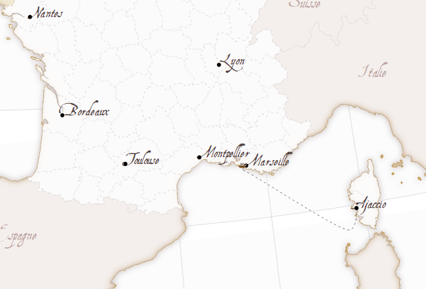
This entries are to explain my last post La Belle France, which had a part with filters and an other with paths, not very clearly explained.
So first, the typhoon path data is needed, and a base map to draw under it too.

Base Map

To draw the maps for this tutorial, the wolrd map at 50m resolution used in most of the mbostock's examples will be used. The base map, is taken from this example, and can be seen, as usual, at bl.ocks.org.


The basic difference from the Mercator example is the projection variable:
var projection = d3.geo.mercator()
    .scale(5*(width + 1) / 2 / Math.PI)
    .translate([width / 2, height / 2])
    .rotate([-125, -15, 0])
    .precision(.1);

  • The scale is multoplied by five, to zoom to the typhoon zone
  • A rotation is added, to center the map to the typhoon zone

Typhoon Haiyan track

It's not easy to find the actual data for the hurricanes and typhoons in a convenient format. After looking into several sites, the one I like the most is this one from Japan. The data is in a list which is possible to copy, but putting all the points into an array is not an amusing activity. So here is the script I've used to transform the data into a json:
f = open("track.txt","r")
out = "["
for line in f:
    day = int(line[12:16])
    hour = int(line[16:18])
    lat = float(line[20:24])
    lon = float(line[28:34])
    h_class = int(line[48:49])

    out += '{"day":%d, "hour":%d, "lat":%.1f, "lon":%.1f, "class": %d},' %(
        day, hour, lat, lon, h_class)
out = out[0:-1] + "]"
f.close()

print out
Where track.txt is the file where I pasted the data copied from the web page.

Links

The base map for the next posts
La Belle France - The blog entry that made me write this post
D3 Mercator world map example
Haiyan typhoon track data, from the Japan Meteorological Agency Best Track Data
Digital Typhoon in English, with tracks from many cuurent and past typhoons
Hong Kong observatory Haiyan typhoon track data


Tuesday, December 3, 2013

La Belle France - Map styling with D3js

When I looked to the vectorial web mapping tools for the first time, I was completely carried away by this example made with Kartograph by the software creator Gregor Aisch.
This example was, actually, the reason I learned Kartograph and published some posts here.
Later, I learned D3js, which was also amazing, but I didn't find a map like La Bella Italia. So I tried to do a similar one myself.

See the working web 
To make the map, I had to reproduce a the result of the Kartograph example to understand how the effects were achieved. Then, get some base data to make the map, and finally, code the example.

Getting the data

The map has, basically, data about the land masses, the countries and the French regions.
I tried data from different places (one of them, Eurostat, that ended in this example), until I decided to use the Natural Earth data. After some attempts, I decided to use the 1:10m data. The files are:

  1. ne_10m_admin_0_countries.shp, clipped using:
    ogr2ogr -clipsrc -10 35 15 60 countries.shp ne_10m_admin_0_countries.shp
  2. ne_10m_admin_1_states_provinces.shp, clipped using:
    ogr2ogr -clipsrc -10 35 15 60 -where "adm0_a3 = 'FRA'" regions.shp ne_10m_admin_1_states_provinces.shp
  3. ne_10m_land.shp, downloaded from github, since the official version gave errors when converted to TopoJSON. Clipped using:
    ogr2ogr -clipsrc -10 35 15 60  land.shp ne_10m_land.shp
With that, the land, countries and regions are available. To merge them into a single TopoJson file, I used:
topojson -o ../data.json countries.shp regions.shp

The html code

Since the code is quite long, and I think that I will made some more posts about specific parts of the technique, the comments are a bit shorter than usually.

CSS

Note how is the font AquilineTwo.ttf  loaded:
@font-face {
    font-family: 'AquilineTwoRegular';
    src: url('AquilineTwo-webfont.eot');
    src: url('AquilineTwo-webfont.eot?#iefix') format('embedded-opentype'),
         url('AquilineTwo-webfont.woff') format('woff'),
         url('AquilineTwo-webfont.ttf') format('truetype'),
         url('AquilineTwo-webfont.svg#AquilineTwoRegular') format('svg');
    font-weight: normal;
    font-style: normal;

}

Later, the font can be set using .attr("font-family","AquilineTwoRegular")

Loading the layers

To achieve the effects, some layers are loaded more than one time, so different filters can be applied to get the shades and blurred borders:
svg.selectAll(".bgback")
    .data(topojson.feature(data, data.objects.land).features)
  .enter()
    .append("path")
      .attr("class", "bgback")
      .attr("d", path)
      .style("filter","url(#oglow)")
      .style("stroke", "#999")
      .style("stroke-width", 0.2);
In this case, the land masses are drawn, applying the effect named oglow, which looks like:
var oglow = defs.append("filter")
  .attr("id","oglow");
  oglow.append("feColorMatrix")
    .attr("in","SourceGraphic")
    .attr("type", "matrix")
    .attr("values", "0 0 0 0 0   0 0 0 0 0   0 0 0 0 0   0 0 0 1 0")
    .attr("result","mask");
  oglow.append("feMorphology")
    .attr("in","mask")
    .attr("radius","1")
    .attr("operator","dilate")
    .attr("result","mask");
  oglow.append("feColorMatrix")
    .attr("in","mask")
    .attr("type", "matrix")
    .attr("values", "0 0 0 0 0.6 0 0 0 0 0.5333333333333333 0 0 0 0 0.5333333333333333  0 0 0 1 0")
    .attr("result","r0");
  oglow.append("feGaussianBlur")
    .attr("in","r0")
    .attr("stdDeviation","4")
    .attr("result","r1");
  oglow.append("feComposite")
    .attr("operator","out")
    .attr("in","r1")
    .attr("in2","mask")
    .attr("result","comp");
To see how svg filters work, many pages are available. I got them looking at the Kartograph example generated html.

Adding the labels

The labels aren't inside the TopoJSON (although they could be!), so I decided the labels to add and put them into an array:
var cities = [ 
                {'pos': [2.351, 48.857], 'name': 'Paris'},
                {'pos':[5.381, 43.293], 'name': 'Marseille'},
                {'pos':[3.878, 43.609], 'name': 'Montpellier'},
                {'pos':[4.856, 45.756], 'name': 'Lyon'}, 
                {'pos':[1.436, 43.602], 'name': 'Toulouse'},
                {'pos':[-0.566, 44.841], 'name': 'Bordeaux'},
                {'pos':[-1.553, 47.212], 'name': 'Nantes'},
                {'pos':[8.737, 41.925], 'name': 'Ajaccio'},
              ];
Then, adding them to the map is easy:
var city_labels =svg.selectAll(".city_label")
    .data(cities)
    .enter();

  city_labels
    .append("text")
    .attr("class", "city_label")
    .text(function(d){return d.name;})
    .attr("font-family", "AquilineTwoRegular")
    .attr("font-size", "18px")
    .attr("fill", "#544")
    .attr("x",function(d){return projection(d.pos)[0];})
    .attr("y",function(d){return projection(d.pos)[1];});


  city_labels
    .append("circle")
    .attr("r", 3)
    .attr("fill", "black")
    .attr("cx",function(d){return projection(d.pos)[0];})
    .attr("cy",function(d){return projection(d.pos)[1];});
Note that the positions must be calculated transforming the longitude and latitude using the d3js projection functions.

The ship

To draw the ship, tow things are necessary, the path and the ship.
To draw the path:
var ferry_path = [[8.745, 41.908],
                  [8.308, 41.453],
                  [5.559, 43.043], 
                  [5.268, 43.187], 
                  [5.306, 43.289]
                  ];
  var shipPathLine = d3.svg.line()
    .interpolate("cardinal")
    .x(function(d) { return projection(d)[0]; })
    .y(function(d) { return projection(d)[1]; });

  var shipPath = svg.append("path")
    .attr("d",shipPathLine(ferry_path))
    .attr("stroke","#000")
    .attr("class","ferry_path");
Basically, d3.svg.line is used to interpolate the points, making the line smoother. This is easier than the Kartograph way with geopaths, where the Bézier control points have to be calculated. d3.svg.line is amazing, more than what I thought before.
I don't know if the way to calculate the projected points is the best one, since I do it twice for each point, which is ugly.
To move the ship, a ship image is appended, and then moved with a setInterval:
  var shipPathEl = shipPath.node();
  var shipPathElLen = shipPathEl.getTotalLength();

  var pt = shipPathEl.getPointAtLength(0);
  var shipIcon = svg.append("image")
          .attr("xlink:href","ship.png")
          .attr("x", pt.x - 10)
          .attr("y", pt.y - 5.5)
          .attr("width", 15)
          .attr("height", 8);

  var i = 0;
  var delta = 0.05;
  var dist_ease = 0.2;
  var delta_ease = 0.9;
  setInterval(function(){
    
    pt = shipPathEl.getPointAtLength(i*shipPathElLen);
    shipIcon
      .transition()
      .ease("linear")
      .duration(1000)
      .attr("x", pt.x - 10)
      .attr("y", pt.y - 5.5);
    
    //i = i + delta;

    if (i < dist_ease){
      i = i + delta * ((1-delta_ease) + i*delta_ease/dist_ease);
    }else if (i > 1 - dist_ease){
      i = i + delta * (1 - ((i - (1 - dist_ease)) * (delta_ease/dist_ease)));
    }else{
      i = i + delta;
    }
    if (i+0.0001 >= 1 || i-0.0001 <= 0)
      delta = -1 * delta;
  },1000);
The ship position is calculated every second, and moved with a d3js transition to make it smooth (calculating everything more often didn't give this smooth effect)
The speed of the ship is changed depending on the proximity to the harbour, to a void the strange effect of the ship crashing into it. The effect is controlled by dist_ease and delta_ease parameters, that change the distance where the speed is changed, and the amount of speed changed.

What's next

  • The SVG filters should be explained in  a better way, maybe packing them into functions as Kartograph does.
  • SVG rendering lasts quite a lot in my computer. The same happens with Kartograph, so the problem comes from the SVG rendering. Anyway, could be improved.
  • A canvas version would be nice.

Links

La Bella Italia -- The example I have used as a model
Gregor Aisch's home page
Natural Earth