Showing posts with label SVG. Show all posts

Tuesday, May 12, 2015

d3-composite-projections

Some countries have regions sparse around the globe, which adds difficulties when drawing maps for them.
D3 already had the albersUsa projection that solved this problem by creating a composed projection, moving Alaska and Hawaii close to the main part of the USA.
But the other countries didn't have a projectino like this. That's why I made this library.

It adds the composite projection for:
With a function that draws a border between the composition zones by returning an SVG path.

There is an example for each region, linked in the list above.

The library web page explains the usage and  installation/testing

If you are going to use it, need more regions/countries or find an error, please leave a comment here.

Saturday, January 4, 2014

D3 map Styling tutorial II: Giving style to the base map


The example La Belle France, or the original La Bella Italia by Gregor Aisch use svg filters to give style to the maps. I haven't found many examples about how to do it, so I will explain here two different styles: a simple shadow under the map, and a style similar to the original map.

As usual, the examples can be seen at my bl.ocks.org page:
Drop shadow
LaBella Italia

SVG filters basics

SVG can style the elements by using css or css-like attributes, like the color, the stroke, and so on. But it's possible to use filters to add efects such as blurring, dilating the shapes, adding lights... This, of course, can be used to change the map polygons too.

A basic usage of an SVG filter is like this:


And the result is:
Note that:

  • The shape (a rectangle defined by the rect tag) is drawn as usual
  • The filter is defined with the filter tag inside the defs section. The filter must have an id to be used in the geometries where it has to be used
  • The filter is applied to the rectangle by using the filter="url(#blur)" attribute, where the id of the filter is added as url(#name_of_the_filter)
This is the easiest filter an SVG can have, but filters can concatenate different effects one after the other or in parallel, as we will see in the following examples. 
A list of all the effects and a tutorial can be found at W3C Schools

Simple shadow

The drop shadow effect gives a quite nice look to the maps and it's fast to process by the browser and easy to code. I took the code from this example.

The map shown in the last post with the effect. The code:


Note that the filter (lines 46 to 66) has several parts:

  • The filter is defined adding a defs tag and appending the filter, with an id and a height tags. The height is added to affect the region outside the geometry. It's not actually necessary in this case, but I kept it to maintain the example code.
  • An feGaussianBlur is then appended (line 50). The in attribute indicates that the input image for the filter is the alpha value of the input image, so if the map is colored in red, the shadow will remain grey. stdDeviation indicates the filter intensity, and output gives an id to use the resulting image, as we will see.
  • Line 55 adds an feOffset filter, that will move the shadow. The dx and dy attributes define how to move the shadow, but the important attribute here is the in, that takes the id defined in the feGaussianBlur tag, so what is moved is the blurred image. Again, an out attribute is defined to use the result image later.
  • Line 61 defines an feMerge tag. This is an interesting property of svg filters that allow to append different filter results one over the other to create more complex outputs. Appended to the tag, an feMergeNode is added at line 63 with the blurred image at the in attribute. At line 65, the original image is appended over the blurred image, with an other feMergeNode tag, with the in attr set to SourceGraphic to indicate the original image.
SVG filters seemed quite dificult to me, but they are actually a kind of instructions one after the other, written in XML.

Styling like La Bella Italia

As it was shown in the post, the filters part of La Bella Italia map is quite complicated. I'll try to show an easy way to get a similar effect. 
Disclaimer: In my old computer, generating these maps is very slow, so maybe it would be better to think about another combination to create cool maps without using the erode and dilate filters.

The map without any effect looks like this:
And the effect has three stacked parts (I'll paste only the part of the code affecting each part, the whole code is here):

  1. A colouring and blurring
    To do it:
    filter.append("feColorMatrix")
        .attr("in","SourceGraphic")
        .attr("type", "matrix")
        .attr("values", "0 0 0 0 0.6 0 0 0 0 0.5333333333333333 0 0 0 0 0.5333333333333333  0 0 0 1 0")
        .attr("result","f1coloredMask");
    filter.append("feGaussianBlur")
      .attr("in", "f1coloredMask")
      .attr("stdDeviation", 15)
      .attr("result", "f1blur");
    So there are two concatenated actions. The first one, feColorMatrix, changes the color of the original image (see how here). The second, blurs it as in the first example.
  2. Eroding, coloring, blurring and composing:
    filter.append("feColorMatrix")
        .attr("in","SourceGraphic")
        .attr("type", "matrix")
        .attr("values", "0 0 0 0 0   0 0 0 0 0   0 0 0 0 0   0 0 0 500 0")
        .attr("result","f2mask");
    filter.append("feMorphology")
        .attr("in","f2mask")
        .attr("radius","1")
        .attr("operator","erode")
        .attr("result","f2r1");
    filter.append("feGaussianBlur")
        .attr("in","f2r1")
        .attr("stdDeviation","4")
        .attr("result","f2r2");
    filter.append("feColorMatrix")
        .attr("in","f2r2")
        .attr("type", "matrix")
        .attr("values", "1 0 0 0 0.5803921568627451 0 1 0 0 0.3607843137254902 0 0 1 0 0.10588235294117647 0 0 0 -1 1")
        .attr("result","f2r3");
    filter.append("feComposite")
        .attr("operator","in")
        .attr("in","f2r3")
        .attr("in2","f2mask")
        .attr("result","f2comp");
    This one is more complicated. 
    1. The first step changes the map color into black, with an alpha value of 0.5. This output will be used in the second and last step.
    2. Then, using the first output, the image is eroded. That is, the land gets smaller by one pixel, using feMorphology with the erode operator. Then, the result is blurred using feGaussianBlur, and coloured as in the first filter.
    3. The resulting image is composited with the original black and white image, using feComposite. The definition of this operator, taken from here, is:
      The result is the part of A that is within the boundaries of B. Don't confuse the name of this attribute value with the in attribute.
  3. The two effects are stacked, and the original map is added at the end:
    var feMerge = filter.append("feMerge");
    
    feMerge.append("feMergeNode")
        .attr("in", "f1blur");
    feMerge.append("feMergeNode")
        .attr("in", "f2comp");
    feMerge.append("feMergeNode")
        .attr("in", "SourceGraphic");
    This part is simple,the feMerge stacks all the outputs indicated in the feMergeNode tags. So in this case, the blurred image goes in the first place, then the eroded one, and finally, the original one. Now, the effect seems quite a lot to the one in La Bella Italia.

Links

Drop shadow map - The first example
La Bella Italia like map - The second example
D3 map Styling tutorial I: Preparing the data - First part of the tutorial
La Bella Italia - Kartograph example by Gregor Aisch
La Belle France - The same example as La Bella Italia, but using D3js
d3.js drop shadow example - SVG drop shadow filter by Charl P. Botha
SVG filters tutorial - W3C Schools tutorial about SVG filters

Tuesday, December 3, 2013

La Belle France - Map styling with D3js

When I looked to the vectorial web mapping tools for the first time, I was completely carried away by this example made with Kartograph by the software creator Gregor Aisch.
This example was, actually, the reason I learned Kartograph and published some posts here.
Later, I learned D3js, which was also amazing, but I didn't find a map like La Bella Italia. So I tried to do a similar one myself.

See the working web 
To make the map, I had to reproduce a the result of the Kartograph example to understand how the effects were achieved. Then, get some base data to make the map, and finally, code the example.

Getting the data

The map has, basically, data about the land masses, the countries and the French regions.
I tried data from different places (one of them, Eurostat, that ended in this example), until I decided to use the Natural Earth data. After some attempts, I decided to use the 1:10m data. The files are:

  1. ne_10m_admin_0_countries.shp, clipped using:
    ogr2ogr -clipsrc -10 35 15 60 countries.shp ne_10m_admin_0_countries.shp
  2. ne_10m_admin_1_states_provinces.shp, clipped using:
    ogr2ogr -clipsrc -10 35 15 60 -where "adm0_a3 = 'FRA'" regions.shp ne_10m_admin_1_states_provinces.shp
  3. ne_10m_land.shp, downloaded from github, since the official version gave errors when converted to TopoJSON. Clipped using:
    ogr2ogr -clipsrc -10 35 15 60  land.shp ne_10m_land.shp
With that, the land, countries and regions are available. To merge them into a single TopoJson file, I used:
topojson -o ../data.json countries.shp regions.shp

The html code

Since the code is quite long, and I think that I will made some more posts about specific parts of the technique, the comments are a bit shorter than usually.

CSS

Note how is the font AquilineTwo.ttf  loaded:
@font-face {
    font-family: 'AquilineTwoRegular';
    src: url('AquilineTwo-webfont.eot');
    src: url('AquilineTwo-webfont.eot?#iefix') format('embedded-opentype'),
         url('AquilineTwo-webfont.woff') format('woff'),
         url('AquilineTwo-webfont.ttf') format('truetype'),
         url('AquilineTwo-webfont.svg#AquilineTwoRegular') format('svg');
    font-weight: normal;
    font-style: normal;

}

Later, the font can be set using .attr("font-family","AquilineTwoRegular")

Loading the layers

To achieve the effects, some layers are loaded more than one time, so different filters can be applied to get the shades and blurred borders:
svg.selectAll(".bgback")
    .data(topojson.feature(data, data.objects.land).features)
  .enter()
    .append("path")
      .attr("class", "bgback")
      .attr("d", path)
      .style("filter","url(#oglow)")
      .style("stroke", "#999")
      .style("stroke-width", 0.2);
In this case, the land masses are drawn, applying the effect named oglow, which looks like:
var oglow = defs.append("filter")
  .attr("id","oglow");
  oglow.append("feColorMatrix")
    .attr("in","SourceGraphic")
    .attr("type", "matrix")
    .attr("values", "0 0 0 0 0   0 0 0 0 0   0 0 0 0 0   0 0 0 1 0")
    .attr("result","mask");
  oglow.append("feMorphology")
    .attr("in","mask")
    .attr("radius","1")
    .attr("operator","dilate")
    .attr("result","mask");
  oglow.append("feColorMatrix")
    .attr("in","mask")
    .attr("type", "matrix")
    .attr("values", "0 0 0 0 0.6 0 0 0 0 0.5333333333333333 0 0 0 0 0.5333333333333333  0 0 0 1 0")
    .attr("result","r0");
  oglow.append("feGaussianBlur")
    .attr("in","r0")
    .attr("stdDeviation","4")
    .attr("result","r1");
  oglow.append("feComposite")
    .attr("operator","out")
    .attr("in","r1")
    .attr("in2","mask")
    .attr("result","comp");
To see how svg filters work, many pages are available. I got them looking at the Kartograph example generated html.

Adding the labels

The labels aren't inside the TopoJSON (although they could be!), so I decided the labels to add and put them into an array:
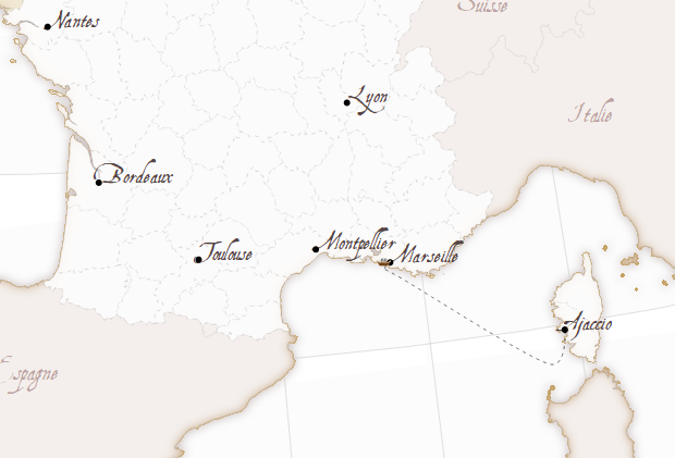
var cities = [ 
                {'pos': [2.351, 48.857], 'name': 'Paris'},
                {'pos':[5.381, 43.293], 'name': 'Marseille'},
                {'pos':[3.878, 43.609], 'name': 'Montpellier'},
                {'pos':[4.856, 45.756], 'name': 'Lyon'}, 
                {'pos':[1.436, 43.602], 'name': 'Toulouse'},
                {'pos':[-0.566, 44.841], 'name': 'Bordeaux'},
                {'pos':[-1.553, 47.212], 'name': 'Nantes'},
                {'pos':[8.737, 41.925], 'name': 'Ajaccio'},
              ];
Then, adding them to the map is easy:
var city_labels =svg.selectAll(".city_label")
    .data(cities)
    .enter();

  city_labels
    .append("text")
    .attr("class", "city_label")
    .text(function(d){return d.name;})
    .attr("font-family", "AquilineTwoRegular")
    .attr("font-size", "18px")
    .attr("fill", "#544")
    .attr("x",function(d){return projection(d.pos)[0];})
    .attr("y",function(d){return projection(d.pos)[1];});


  city_labels
    .append("circle")
    .attr("r", 3)
    .attr("fill", "black")
    .attr("cx",function(d){return projection(d.pos)[0];})
    .attr("cy",function(d){return projection(d.pos)[1];});
Note that the positions must be calculated transforming the longitude and latitude using the d3js projection functions.

The ship

To draw the ship, tow things are necessary, the path and the ship.
To draw the path:
var ferry_path = [[8.745, 41.908],
                  [8.308, 41.453],
                  [5.559, 43.043], 
                  [5.268, 43.187], 
                  [5.306, 43.289]
                  ];
  var shipPathLine = d3.svg.line()
    .interpolate("cardinal")
    .x(function(d) { return projection(d)[0]; })
    .y(function(d) { return projection(d)[1]; });

  var shipPath = svg.append("path")
    .attr("d",shipPathLine(ferry_path))
    .attr("stroke","#000")
    .attr("class","ferry_path");
Basically, d3.svg.line is used to interpolate the points, making the line smoother. This is easier than the Kartograph way with geopaths, where the Bézier control points have to be calculated. d3.svg.line is amazing, more than what I thought before.
I don't know if the way to calculate the projected points is the best one, since I do it twice for each point, which is ugly.
To move the ship, a ship image is appended, and then moved with a setInterval:
  var shipPathEl = shipPath.node();
  var shipPathElLen = shipPathEl.getTotalLength();

  var pt = shipPathEl.getPointAtLength(0);
  var shipIcon = svg.append("image")
          .attr("xlink:href","ship.png")
          .attr("x", pt.x - 10)
          .attr("y", pt.y - 5.5)
          .attr("width", 15)
          .attr("height", 8);

  var i = 0;
  var delta = 0.05;
  var dist_ease = 0.2;
  var delta_ease = 0.9;
  setInterval(function(){
    
    pt = shipPathEl.getPointAtLength(i*shipPathElLen);
    shipIcon
      .transition()
      .ease("linear")
      .duration(1000)
      .attr("x", pt.x - 10)
      .attr("y", pt.y - 5.5);
    
    //i = i + delta;

    if (i < dist_ease){
      i = i + delta * ((1-delta_ease) + i*delta_ease/dist_ease);
    }else if (i > 1 - dist_ease){
      i = i + delta * (1 - ((i - (1 - dist_ease)) * (delta_ease/dist_ease)));
    }else{
      i = i + delta;
    }
    if (i+0.0001 >= 1 || i-0.0001 <= 0)
      delta = -1 * delta;
  },1000);
The ship position is calculated every second, and moved with a d3js transition to make it smooth (calculating everything more often didn't give this smooth effect)
The speed of the ship is changed depending on the proximity to the harbour, to a void the strange effect of the ship crashing into it. The effect is controlled by dist_ease and delta_ease parameters, that change the distance where the speed is changed, and the amount of speed changed.

What's next

  • The SVG filters should be explained in  a better way, maybe packing them into functions as Kartograph does.
  • SVG rendering lasts quite a lot in my computer. The same happens with Kartograph, so the problem comes from the SVG rendering. Anyway, could be improved.
  • A canvas version would be nice.

Links

La Bella Italia -- The example I have used as a model
Gregor Aisch's home page
Natural Earth


Wednesday, August 28, 2013

Flag map with D3js

 In this example I'll show how to draw a map filling the polygons with images. In this case, Western Africa contries filled with their flags:

The zone represented is this one:

As usual, you can get all the code at GitHub:


Canvas

The code basically uses Mike Bostock's queue.js to download all the flag images from the wikipedia, the world borders and the contries names. Once everyting is donwloaded, a function is triggered, that draws the flags, clipping them by the country shape. The first version is written using Canvas instead of SVG, just to see how the clipping and loading of external images is done.

The code:


  • I make an array with all the image locations, indexing by name to make it easier to understand, even though the map file doesn't contain names but indexes.
  • Lines 37 to 47 configure the map projection and the Canvas element.
  • Lines 54 to 77 load all the elements. Since loading an image is not a function in D3js, a custom function has to be created, returning the error or the success value. If images are not preloaded, the code will try to paste them anyway, so the country flag won't be drawn
  • Function ready is triggered when everything is loaded, and it actually draws the map.
    • The error is handled at the first lines (very poorly, I know, a nodata image could be loaded, or something like that)
    • Until line 97, the base map is loaded (the land gets hidden later by the flags).
    • Lines 100 to 109 get the countries from the list, looks for them in the countries file by using a filter function and creates the images we are going to use later.
    • At line 111, all the flags are pasted on the map.
      • context.save();  Saves what has been drawn until the moment, so new things can happen
      • Then, the country border is drawn in a path, without using any color or fill, because then, context.clip(); is called to use this path as the clip path.
      • The image is pasted, using the drawImage method. The bounds are recalculated before for the countries that appera cut at the map.
      • context.restore(); frees the clipping.
    • Finally, at line 130, the borders are drawn to make the map prettier.

SVG

The SVG version is simplier, because no image preloading is needed, since the svg contains only the image source, and the browser will draw it when the image loads.


  • The code is almost the same, just that it doesn't preload the images with queue.js
  • Obviously, the canvas tag is replaced by SVG, and to draw, the usual SVG mode is used.
  • To clip, a clipPath is defined with the country shape and an id, so it can be assigned to an image. 
  • The image is added using an image tag
    • xlink:href sets the image link
    • clip-path sets the path used to clip the image
    • preserveAspectRatio has to be set as none, so the image ratio can be changed to make the flag fit the bounding box.

Notes:

To preload images using queue.js I asked this question at StackOverflow, kindly
answered by explunit.

Wednesday, August 14, 2013

Representing population density with D3js


Choropleth maps represent variables colouring (or filling with a pattern) areas in the map.
We were discussing a map with the local OGGeo group in Barcelona, and we all noticed that it had a problem.
The map was about the percentage of people in Catalonia whose home language was Catalan.It showed most of the areas coloured as mostly Catalan-speakers zone, but since the greatest share of the population in Catalonia is around the city of Barcelona, where Spanish is more spoken as primary language, the map could give a wrong impression to people that didn't know the population distribution in Catalonia.

Cartograms are thought to solve this problem, but the author of the map didn't like them, because if the population is very unevenly distributed, the result is really difficult to understand
Map taken from the Wikipedia's cartogram entry

So I tried a pair of things to see if the result was better. The examples code are in a GIST at GitHUB, so they can be visualized at http://bl.ocks.org:

Resizing polygons according to the population density

Every comarca (the regions Catalonia is divided in) is coloured according to the percentage of people able to speak Catalan (yes, I couldn't find the number of people who has Catalan as their first language). When the button is pressed, the coloured polygons shrink according to the population density of the region:
The only comarca that stays with the same size is Barcelonès, since is the one with the highest population density. You can see that the dark-green zones are low populated, so they shrink a lot.
It's very difficult to me to see the color when the polygon gets too small, even though I didn't shrink them linearly, but smoothing it with a square root, so I think that it's not the best solution.
Since the code is very similar to the one at Mike Bostok's example I won't comment it.

Filling with points according to the population density

This example at Kartograph web page gave me the idea for the second example, although I changed it a little using colors.
 In this case, every polygon is filled with circles. The color of the circle represents the magnitude we are showing (% of people able to speak Catalan, in this case), and the size represents the population density.
I think that the result is clearer in this case. The separation between circles and the maximum circle radius can be adjusted to get better results.
I will comment the code, since I had to write it from the scratch.

Basically, for each polygon, the bounding box is calculated, and the region filled with dots. Then, the polygon is used to clip the rectangle of circles.

Point density according to the population density


  •  The first lines set the pointSeparation and maxPointSize and set the color scale.
  • Lines 20 to 31 set the projection and the SVG element.
  • Lines 32 to 47 get the data about the number of speakers and population, and set the maximum and minimum values to be able to adjust colors and circle sizes.
  • Line 49 sets the color scale
  • Lines 53 to 60 sets the masks for each polygon by appending a clipPath
  • Then, from 63 to 69, the points are drawn by calling the function draw_circles for each polygon. To call the function, the each method is used. The clip-path attribute links the masks set before.
  • Lines 74 to 93 contain the function draw circles.
    • The bounding box and centroid are nneded. The first one to get the width and height, and the second to move it at he region center.
    • Once the size is set, the grid is drawn with the two loops
  • lines 95 to 100 draw the borders
  • lines 102 to 120 draw the legend.

Notes

I created a GIST to store all the data for both examples, since It's easier to re-use it.

Tuesday, January 15, 2013

Kartograph tutorial III: Symbols


Adding symbols to a map is almost mandatory. Kartograph has this capability using the addSymbols method.
By the way, the documentation page is not well linked in the web.  The right symbols documentation page is here.

The data

As usual, all the data used in the example is available. I have switched to GitHub, so the files are there.I have also created a web page to put all the stuff related to the blog: http://rveciana.github.com/geoexamples/
We will use a map of Morocco for the examples. All the borders and cities are taken from Natural Earth. The pages are at the "1:10m cultural vectors" page, and the layers used are countries and populated places.

Since the web page will need an SVG image to get the map data, generate using the command:

    kartograph -o morocco.svg morocco.json

Then, we will use a csv file to read the data we will put in the map, so ogr2ogr is necessary to convert the files from the original shapefile:

ogr2ogr -clipdst -12 26 0 38 -f csv csv ne_10m_populated_places.shp

Note that the option -clip is used to reduce the output file size, which is quite critical when drawing it with JavaScript.

Drawing the data as bubbles


The basic way to draw point data using Kartograph (or the most used in the examples) is what they call bubbles. A bubble is a circle with a user defined radius that may be used to represent data values.
Let's see the Javascript corresponding to this working example:
function loadMap(){
var map = Kartograph.map('#map', 500, 0);
map.loadMap('morocco.svg', function() {
     
    map.addLayer('world',{'name':'bg',
                'styles': {
                    'stroke': '#aaa',
                    'fill': '#f6f4f2'
                }});
    map.addLayer('world',{'name':'moroccobg'});
    map.addLayer('world',{'name':'moroccofg'});
 
     
    map.getLayer('moroccobg').style('stroke', function(data) {
       return data.country == "Morocco" ? '#d8d6d4' : '#aaa';
    }).style('stroke-width', function(data) {
       return data.country == "Morocco" ? 10 : 1;
    }).style('stroke-linejoin', function(data) {
       return data.country == "Morocco" ? 'round' : null;
    });
     
    map.getLayer('moroccofg').style('stroke', function(data) {
       return data.country == "Morocco" ? '#333' : '#aaa';
    }).style('fill', function(data) {
       return data.country == "Morocco" ? '#fff' : null;
    });

    $.ajax("./data/csv/ne_10m_populated_places.csv").done(
     function(data) {
        var points = [];
        var textLines = data.split(/\r\n|\n/);
        for (var i=1; i<textLines.length; i++) {
            var fields = textLines[i].split(',');
            points.push({lon: parseFloat(fields[22]), lat: parseFloat(fields[21]), name: fields[4], population: parseInt(fields[26])});
        }
         
        $.fn.qtip.defaults.style.classes = 'qtip-light';
        var scale = $K.scale.sqrt(points, 'population').range([0, 40]);

        map.addSymbols({
            type: Kartograph.Bubble,
            data: points,
            location: function(d) { return [d.lon, d.lat]; },
            radius: function(d) { return scale(d.population);},
            tooltip: function(d) {
                return '

'+d.name+'

population: '+d.population; }, sortBy: 'radius desc', style: 'fill:#800; stroke: #fff; fill-opacity: 0.4;' }); }); }, { padding: -2 }) };

Let's see the different parts of this first example:
  •  First the background data is loaded into a map object. Lines 2-3
  • Then, the layers are added with the addLayer method, using alias so the same layer can get more than one style, as explained here
  • After that, the styles are set to each layer, up to the line 26
  • Then, using the jQuery ajax function, the csv file is retrieved. This file contains de big cities location, name and population, that will be used to draw the bubbles.
  • Once the csv file is loaded, the code can draw the bubbles. First, the csv is parsed into an array points containing objects with the necessary info. Lines 30-35.
  • The qtip is inicializad. This will enable the tooltips showing the city name when the mouse is over the bubble. Line 37
  • A scale is defined. This Kartograph function takes all the data (population field from the points array), gets the maximum and minimum values, applies the function we want to set the radius (sqrt, so the circle area is proportional to the population). Then, the range method sets the minimum and maximum radius we want to use. Line 38
  • Then, the bubbles are added using the addSymbols method. In this case, the options used are: Line 40
    • type: The Bubbles type is set here. I haven't found a good list of all the available types.
    • data: The points array.
    • location: Where in every item in the data array the longitude and latitude can be found. In this case, the data is passed in an array, but the object can be also a kartograph.LonLat object.
    • radius: In this case, the scale function defined before is called, but any other possibility is OK if the function returns the number of pixels. The radius can be a fixed number too.
    • tooltip: When filled, this option sets the tool tip shown when the mouse is over the symbol. To do so, the jquery.qtip.js must be included, although is used with this option instead what you will find in the official qtip docs. Any html code can be added here. 
    • order: Sets the order to draw the symbols. Ordering by radius allows the small icons to be over the big ones, so the 
    • style: Finally, the bubble style can be set here
  • The padding is set as the second parameter of the loadMap method.  This clips a little the map, so it the lines closing the polygons are not visible. Check which value is better in every case. Line 56

Clustering 


As you can see in the previous example,  if the number of bubbles to draw in a small area is too big, the result is not very attractive. To avoid that, two clustering options are provided:
  • Noverlap: Avoids, as the name suggests, the bubbles overlapping.  A small overlapping can be allowed using the tolerance parameter
  • k-Means: First, a number of bubbles is defined (64 by default). Then, every element is assigned to one of the clusters.
You can compare the results and see the different source codes at this web page. Let's see only the part of the code that changes so the post keeps a reasonable length. Using the noverlap method as in this example web:

map.addSymbols({
            type: Kartograph.Bubble,
            data: points,
            location: function(d) { return [d.lon, d.lat]; },
            radius: function(d) { return scale(d.population);},
            tooltip: function(d) {
                return '

'+d.name+'

population: '+d.population; }, clustering: 'noverlap', aggregate: function(d){ var name = "" var population = 0; $.each(d, function(i, city) { name += " "+city.name; population += city.population; }); return { name: name, population: population }; }, sortBy: 'radius desc', style: 'fill:#800; stroke: #fff; fill-opacity: 0.4;' });

  • clustering: This option appears so be set as noverlap or k-mean. Line 11
  • aggregate: This is the important part. The structure returned here will overwrite the original from the data. The position is already calculated, but the other parameters can be re-calculated.
    In our case, since several cities are added as one single bubble, the most logical is to represent this point with the aggregate population. The parameter d in the function will be an array with all the points, so we use the .each method from jQuery to iterate. Line 15.
    The name is also overwritten to show all the cities included in the new bubble.
If the clustering option is using k-Means, the clustering option will be changed as follows:
clustering: 'k-means',
clusteringOpts: {
    size: 64
},

Changing the size tag to the number of clusters to represent. I think that in this case is important to tune, since the results change a lot.

As a final comment to the Kartograph clustering, there is a thing I don't understand: Some bubbles present when no clustering is applied disappear with the noverlap method. For instance, look at the comparison example to the city of Tindouf, the most southern of all. The city disappears in the noverlap method, and is not aggregated to any new bubble, although no overlap occurs. When using the k-Means, is properly aggregated to other bubbles.


Image icons

Is possible to use images as symbols instead of bubbles. This allows to put fixed icons as in the cool La Bella Italia example.
Here, we will see how to represent the geotagged Flickr images on a map (which was the original idea for this post).
There are two differences from the original code.
The first one is that Flickr offers feeds in JSON format. The cool thing is that is possible to get only pictures from a selected country, region or city. So the example could be used at city level.
The code and the working page are here, but the part that changes is, of course the parsing of the csv file, which looks now like this:

$.getJSON("http://www.flickr.com/services/feeds/geo/Morocco?jsoncallback=?",
     {
       format: "json"
     },
     function(data) {
        var points = []
        $.each(data.items, function(i,item){
            points.push([new $K.LonLat(item.longitude,item.latitude),item.title,item.media.m]);
            if ( i == 100 ) return false;
        });

Is much easier than the other, since the JSON file is transformed directly into an object.
The second difference is the addSymbols:
map.addSymbols({
    type: $K.Icon,
    data: points,
    location: function(d) {return d[0]; },
    icon: function(d) { return d[2]; },
    iconsize: [30,30],
    offset: [-15,-15],
    title: function(d) {return d[1]; },
    tooltip: function(d) {return [d[1],''];},
});

Note that:
  • Here, the LonLat object has been used instead of the array to set the location (just to show how to do it).
  •  The type is now Icon
  • The label icon sets the image source, which is part of the Flickr feed in this example.
  • The iconsize label can change the icon size. By default is 10x10 pixels.
  • The offset label centers the icon (I have checked that the location is set at the left top of tie image)
  • Tooltip and title must be set this way to give the result shown. Both interact with the qtip plugin.
Finally, I'm very frustrated with the clustering when using icons. In this case is completly necessary, since many pictures are at the same touristic points, but I haven't found how to do it. Maybe somebody can help.

Thursday, November 29, 2012

kartograph tutorial II: going interactive

In my last post I showed how to create a cool SVG map using Kartograph, to be opened and edited with an Inkscape-like program.
The elections were celebrated and CiU won again, but with less votes. I could either update the map or play with the same data. The fun with Kartograph is using the generated SVG to create interactive web pages using Kartograph.js, so this is what I'll do.
The web page will be able to:
  • Generate the map not only for the first position, but also for the others
  • Query every municipality to know which were the results there.
As usual, the code is available to download, and at the working web page too.

This second example has a continuation post: Kartograph tutorial III: Symbols
 
Changes to the SVG
In the other post, we used the SVG only to draw, but now we need to add data to it, so we can query it.
So change the municipalities layer at the file elections.json from:
   "municipalities":{
       "src": "./mun_out.shp"
   }

to:
   "municipalities":{
       "src": "./mun_out.shp",
       "attributes": {"winner": "Winner","ciu": "CiU","psc":"PSC-PSOE","erc":"ERC","pp":"PP","icv":"ICV-EUiA","cs":"C's","name":"Name"}
   }

This will add the attributes set in the shapefile geometries to the SVG geometries.
To generate the SVG again, just type:
kartograph -o elections.svg elections.json

Viewing the map in a web page

Even though is quite simple, I haven't found any really basic working example, so here it is:

<html>
    <head>
        <script src="jquery-1.8.3.min.js"></script>
        <script src="raphael-min.js"></script>
        <script src="kartograph.min.js"></script>
 <script language="JavaScript">
function loadMap(){
var map = Kartograph.map('#map', 600, 0);

map.loadMap('elections.svg', function() {

    map.addLayer('background');
    map.addLayer('world');
    map.addLayer('depth');
    map.addLayer('trees');
    map.addLayer('crops');
    map.addLayer('municipalities');
     
}, { padding: -30 })
}
</script>
    </head>
    <body onLoad="loadMap()">

        <div id="map"></div>
    </body>
</html>

  1. Include jquery, raphael and kartograph
  2. The map must be created when the page loads, so the function loadMap() is called at the body tag , using the onLoad event.
  3. Kartograph.map('#map', 600, 0) creates the map at the div tag with the id map. X size will be 600 px, and the aspect ratio will be respected, because the y size is 0. When an other y is set, strange things happen with the png borders.
  4. loadMap draws the map from the file elections.svg. Then, executes a function. In this case, the function loads all the layers one by one, using the method addLayer(LayerNameInTheSVG)
  5. padding: -30 removes the strange lines from the vectors in the borders by padding the image. Try without using it to understand what happens.


This renders the SVG without any styling or interaction. But is the basic way to start any Kartograph.js project.

CSS Styling

There are two ways to add styles to the map. We will use both, to show them.
The first one, is to use a separate css file, as in the last post.
Adding the css file is quite tricky, because of the IExplorer compatibility. Now, the loadMap call would look like:

map.loadMap('elections.svg', function() {
 map.loadCSS('elections.css', function() {
  map.addLayer('world');
   ...
 });
})
So, the only thing that the loadMap method does, is calling the loadCss method, which will do all the stuff.

The css file is also different than the one used before. To style the layer world, the css section will be:
#map svg path.world {
stroke: #fff;
fill: #cccccf;
fill-opacity: .7;
}

Tip1: Be careful, Chrome doesn't reload your css even though you use ctrl-F5!
Tip2: Do not separate the CSS elements with comas (look at the example). With the python example, this didn't matter.
The other way is using the style method from the layer, as we will see in the final part of the post.

Adding tooltips

If we want the web page to show a tooltip with the result when the mouse is over a municipality, just add a tooltip to the desired layer (municipalities, in this case). The function in loadCSS will be now:
map.loadCSS('elections.css', function() {
 ...
 map.addLayer('municipalities');

$.fn.qtip.defaults.style.classes = 'qtip-light';

 map.getLayer('municipalities').tooltips(function(data) {

return [data.name, 'CiU: <b>' + data.ciu + '</b><br/>PSC-PSOE: <b>'+ data.psc + '</b><br/>ERC: <b>' + data.erc+'</b><br/>PP: <b>'+data.pp+'</b><br/>ICV-EUA: <b>'+data.icv+'</b><br/>C\'s: <b>'+data.cs+'</b>'];
});
});

A function is called as a parameter to the tooltips method of the layer municipalities. This function returns what we want to be shown in the tooltip. The data parameter has all the attributes in the SVG geometries. In this case, a list with the results is shown.
The other line in the code just sets the style of the tooltip. The official documentation has more information about the options.
Also, the tooltips styles and javascript must be included in the header, adding:

<script src="jquery.qtip.js"></script>
 <link rel="stylesheet" type="text/css" href="jquery.qtip.css"/>


Setting the colors in the map

Finally, the map will be colored. By default, depending on the winner party, but with a combo box to choose the position.
So first, a function is created to sort the results in every municipality, and set the style with a different color for every party:

function setColors(value){
 map.getLayer('municipalities').style('fill', function(data) {

    var positions = new Array();
    positions[0] = parseInt(data.ciu);
    positions[1] = parseInt(data.psc);
    positions[2] = parseInt(data.erc);
    positions[3] = parseInt(data.pp);
    positions[4] = parseInt(data.icv);
    positions[5] = parseInt(data.cs);

    positions.sort(function(a,b) { return b-a; });

    var bgColor;
    if (positions[value-1] == parseInt(data.ciu)){
        bgColor = "#99edff";
    } else if (positions[value-1] == parseInt(data.psc)){
        bgColor = "#ff9999";
    } else if (positions[value-1] == parseInt(data.erc)){
        bgColor = "#EDE61A";
    } else if (positions[value-1] == parseInt(data.pp)){
        bgColor = "#005aff";
    } else if (positions[value-1] == parseInt(data.icv)){
        bgColor = "#74ff74";
    } else if (positions[value-1] == parseInt(data.cs)){
        bgColor = "#ff7b00";
    }
    
    
    return bgColor;
 });
}
First, we set the style to the layer with the method style. the first argument is the property to change, fill in this case. The second parameter is the value to set. In this case, it will depend of the function that chooses the position. Things to look at:
  • value is the position to show (from 1 to 5)
  • To sort the positions in the array in descending order, use the sort() method, with a function to order the elements as numbers. See why here.
  • Then, check which party corresponds to the number of votes at the desired position, and set the color.
This function will be called at the beginning to show the first position by default:
setColors(1);
and a select element is created to select the position and change the colors when the option is changed:
<select onChange="changePos(this)">

<option value="1">1st position</option>

<option value="2">2nd position</option>
<option value="3">3rd position</option>
<option value="4">4th position</option>
<option value="5">5th position</option>
</select>
An auxiliar function is created to get the option value:
function changePos(sel){
 var value = sel.options[sel.selectedIndex].value;
 setColors(value);
}
 
That's all!
The best is to download the code or look at the working web.
Of course, some styling is still needed to do a deliverable web page, but the main idea is already done.


Saturday, November 24, 2012

Kartograph tutorial: Electoral map

Tomorrow I will be all the day at the polling station, since I've been chosen as a member.
The last two weeks I was playing with the amazing Kartograph software, so it was a good moment to experiment with electoral maps (the first time for me).

 In this example, I will explain step by step how to create the map above. It's quite similar to this tutorial, but I want to continue in a new post, going interactive.
Kartograph creates vector SVG images, which you can edit later with Inkscape or Illustrator, so gives much more flexibility than systems generating PNG like files, much more difficult to modify.
As in all the posts, you can get all the files used in the example.
This example has two continuation posts: 

Getting the data

As usual, getting the data is not so easy. The Catalan government has a good open data web site, where I found:
  • A file with a really descriptive name, bm50mv33sh1fc1r170.zip, with all the administrative boundaries (provinces, comarques, and municipalities).
  • Lots of files with election results. I choose the 2010 elections, since they where to the Catalan parliament, like the ones tomorrow. As you can see on the map, the party CiU won with a very big majority, so the map is not as interesting as it could be.
I have used the municipalities to draw the map because the result is more diverse than using bigger zones. Actually, the real  constituency is the province, but CiU won everywhere, and a plain blue map is quite boring.
So I've had to join the two files to get one file with the geometries and the results. The process is quite long and dirty (why didn't they use an id? I had to join with the names), so I won't explain how to do it, but put the result at the data files. You can find this file here.

Then, to decorate the map, I used the following files
  • World boundaries from Natural Earth (ne_10m_admin_0_countries.zip), to draw the coast line outside Catalonia
  • From VMAP, the layers Trees, Crops, and DepthContours, to decorate the map outside the electoral  constituencies.
Since the layers are worldwide, so very big, I have used these ogr commands to clip:
 ogr2ogr -clipsrc -3 37 4 44 Trees2.shp Trees.shp
and to simplify:
 ogr2ogr -simplify 10 munis.shp bm50mv33sh1fpm1r170.shp
Doing so, the time to generate the map is divided by five or more.

Installing Kartograph

Since we only need kartograph.py for this tutorial,  first, download it from the github page clicking at the zip icon.
In a linux system, uncompress and execute 
python setup install
as a super user.
That's all, if you have the GDAL python bindings installed.

Creating the map

To create a map with Kartograph, you will need a configuration file in JSON format, which will have three basic sections:

Projection

To set the projection, there used to be a web page named Visual map configurator, that doesn't work any more. But don't worry, you can use the Map Projections page. Just choose the projection that fits you more, change the parameters and click the gear icon:
A dialog will open, and the lines that are interesting in this case are, in the image example, like:
         "proj": "sinusoidal",
        "lon0": 20
This will be translated in our json file as:
     "proj": {
            "id": "sinusoidal",
           "lon0": 20
     }

 Bounds:

The part of the world we want to represent is set here. It's quite well explained at the documentation, but it can be a bit confusing, and not all the options work with all the projections.
In our example, I have used:
  "bounds": {
    "mode": "bbox",
    "data": [-0, 40, 4, 43],
    "crop": [-3, 37, 5, 44]
  } 

  • mode: How the bounds are expressed. BBOX is the basic option, but you can also set it defining the points you want to enter in the map, or even the features in a layer. If the layers are in different projections, other modes can be a little tricky.
  • data: In our case, the bounding box. In other modes, the layer name, the points, or whatever.
  • crop: Is an optional label. Our svg will be clipped at the bounds set at data, but all the data in the files will be processed. If the files include all the world, this takes a long time, and generates much bigger SVG outputs. With crop, only the features inside the BBOX will be included.

Layers:

As the name suggests, the layers to include. 
The shapefiles are added as:
   "municipalities":{
       "src": "./mun_out.shp"
   }
There are also two special layer, graticule and sea. The first draws the meridians ans parallels, while the second does nothing more than giving a feature to draw the background:
   "background": {"special": "sea"},
   "graticule":{ "special": "graticule", "latitudes": 1, "longitudes": 1}

All the layers  will be drawn in the order indicated at the json file, so this must be well chosen to select which layer hides what.

Styling

This is the nice part. Without styling, the SVG can be used directly with Inkscape or Kartograph.js, but is possible to generate styled maps directly with kartograph.py.
You can give the style either in the json file or in a separate css file, which seems cleaner. The names given to the layer are the ones to be used in the css as the id. So to give a style to the municipalities layer, add
#municipalities {
 fill: #FFF;
 stroke: #882222;
 stroke-width: 0.5px;
 stroke-opacity: 0.4;
}
The general options are at the documentation again. CSS for SVG is a little different from the one used in traditional html.
Since we want to paint the municipalities in a different color depending of the party who won the elections, we will use filters, like this one:
#municipalities[Winner=CiU]{
 fill: #99edff;
}

It would be nice to compare different fields i.e. CiU > PSOE, but this is not possible (at least, I haven't found how to do it), so I had to calculate the winner and put it in a field (called Winner, as you can see in the example)

Drawing

There are two options to draw the map. A command line program is installed with the setup, called kartograph. 
To draw the styled map, just type
   kartograph elections.json --style elections.css -o elections.svg
But you can also include all this in a python program, so could generate the data and then the map. In our case, the code would be
from kartograph import Kartograph
from kartograph.options import read_map_descriptor
import sys
K = Kartograph()
css = open("elections.css").read()
cfg = read_map_descriptor(open("elections.json"))
K.generate(cfg, outfile='elections.svg', format='svg', stylesheet=css) 
 
Finally, I edited the svg file with Inkscape to put the titles and legend. Is just to show that the idea is generating a base svg and from there, draw the pretty final map.

Configuration files

To draw the map in the example, I have used the following files:
elections.json
{
"proj": {
        "id": "sinusoidal",
        "lon0": 20
  },
   "layers": {
   "background": {"special": "sea"},
   "graticule":{ "special": "graticule", "latitudes": 1, "longitudes": 1, "styles": { "stroke-width": "0.3px" } },
    "world":{
       "src": "data/ne_10m_admin_0_countries2.shp"
   }, 
   "trees":{
      "src": "data/Trees2.shp",
      "simplify": true
   },
   "crops":{
      "src": "data/Crops2.shp",
      "simplify": true
   },
   "depth": {
       "src": "data/DepthContours2.shp",
       "simplify": true
   },
   "municipalities":{
       "src": "./mun_out.shp"
   }
   },
  "bounds": {
    "mode": "bbox",
    "data": [-0, 40, 4, 43],
    "crop": [-3, 37, 5, 44]
  }
}

elections.css
#background {
 fill: #e8f9fb;
 stroke: none;
},
#world {
 fill: #f5f3f2;
 stroke: none;
},
#graticule {
 stroke-width: 0.3px;
},
#municipalities {
 fill: #FFF;
 stroke: #882222;
 stroke-width: 0.5px;
 stroke-opacity: 0.4;
},
#municipalities-label {
 font-family: Arial;
 font-size: 13px;
},
#municipalities[Winner=CiU]{
 fill: #99edff;
},
#municipalities[Winner=PSC-PSOE]{
 fill: #ff9999;
},
#municipalities[Winner=ERC]{
 fill: #EDE61A;
},
#depth {
 stroke: #223366;
 stroke-width: 0.5px;
 stroke-opacity: 0.4;
},
#trees {
  fill: #d2f8c0;
  stroke: none;
},
#crops {
  fill: #fcf8d8;
  stroke: none;
}

What's next

If I have time, I'll try my first Kartograph.js example. From the svg generated, is possible to create cool interactive maps.