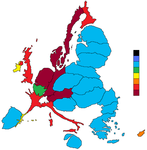
Choropleth maps represent variables colouring (or filling with a pattern) areas in the map.
We were discussing a map with the local OGGeo group in Barcelona, and we all noticed that it had a problem.
The map was about the percentage of people in Catalonia whose home language was Catalan.It showed most of the areas coloured as mostly Catalan-speakers zone, but since the greatest share of the population in Catalonia is around the city of Barcelona, where Spanish is more spoken as primary language, the map could give a wrong impression to people that didn't know the population distribution in Catalonia.
Cartograms are thought to solve this problem, but the author of the map didn't like them, because if the population is very unevenly distributed, the result is really difficult to understand
 |
| Map taken from the Wikipedia's cartogram entry |
So I tried a pair of things to see if the result was better. The examples code are in a GIST at GitHUB, so they can be visualized at http://bl.ocks.org:
Resizing polygons according to the population density
The first map is based on Mike Bostock's Non-Contiguous cartogram example:
Every comarca (the regions Catalonia is divided in) is coloured according to the percentage of people able to speak Catalan (yes, I couldn't find the number of people who has Catalan as their first language). When the button is pressed, the coloured polygons shrink according to the population density of the region:
The only comarca that stays with the same size is Barcelonès, since is the one with the highest population density. You can see that the dark-green zones are low populated, so they shrink a lot.
It's very difficult to me to see the color when the polygon gets too small, even though I didn't shrink them linearly, but smoothing it with a square root, so I think that it's not the best solution.
Since the code is very similar to the one at Mike Bostok's example I won't comment it.
It's very difficult to me to see the color when the polygon gets too small, even though I didn't shrink them linearly, but smoothing it with a square root, so I think that it's not the best solution.
Since the code is very similar to the one at Mike Bostok's example I won't comment it.
Filling with points according to the population density
This example at Kartograph web page gave me the idea for the second example, although I changed it a little using colors.
In this case, every polygon is filled with circles. The color of the circle represents the magnitude we are showing (% of people able to speak Catalan, in this case), and the size represents the population density.
I think that the result is clearer in this case. The separation between circles and the maximum circle radius can be adjusted to get better results.
I will comment the code, since I had to write it from the scratch.
Basically, for each polygon, the bounding box is calculated, and the region filled with dots. Then, the polygon is used to clip the rectangle of circles.
Point density according to the population density
- The first lines set the pointSeparation and maxPointSize and set the color scale.
- Lines 20 to 31 set the projection and the SVG element.
- Lines 32 to 47 get the data about the number of speakers and population, and set the maximum and minimum values to be able to adjust colors and circle sizes.
- Line 49 sets the color scale
- Lines 53 to 60 sets the masks for each polygon by appending a clipPath
- Then, from 63 to 69, the points are drawn by calling the function draw_circles for each polygon. To call the function, the each method is used. The clip-path attribute links the masks set before.
- Lines 74 to 93 contain the function draw circles.
- The bounding box and centroid are nneded. The first one to get the width and height, and the second to move it at he region center.
- Once the size is set, the grid is drawn with the two loops
- lines 95 to 100 draw the borders
- lines 102 to 120 draw the legend.
Notes
I created a GIST to store all the data for both examples, since It's easier to re-use it.


It's really a wonderful and handy piece of information. I rejoice that you just shared this valuable details with us.Thanks for sharing with us.
ReplyDeleteVisit our website: Clipping path
Hello mmate nice blog
ReplyDelete