Wednesday, November 26, 2014

Basemap Tutorial

Basemap is a great tool for creating maps using python in a simple way. It's a `matplotlib <http://matplotlib.org/>`_ extension, so it has got all its features to create data visualizations, and adds the geographical projections and some datasets to be able to plot coast lines, countries, and so on directly from the library.

Basemap has got `some documentation <http://matplotlib.org/basemap/index.html>`_, but some things are a bit more difficult to find. I started a readthedocs page to extend a little the original documentation and examples, but it grew a little, and now covers many of the basemap possibilities.

Some of the examples from the tutorial

The tutorial can be found at http://basemaptutorial.readthedocs.org/, and all the examples and its source code, at GitHub and it's available for sharing or being modified by adding the attribution.

The tutorial covers:
 I would really appreciate some feedback, the comments are open!


Saturday, October 11, 2014

Basemap raster clipping with a shapefile

 Basemap is a great library for mapping faster than other python options, but there are some usual things I couldn't find how to do. Clipping a raster using a shape is one of them. Here's how do I do it
The output
As usual, all the code can be found at GitHub

Getting some data

The example plots some elevation data, taken from the SRTM. After looking for some options, the easiest to work with was this one: http://srtm.csi.cgiar.org/SELECTION/inputCoord.asp
The shapefile will be the border of Andorra, taken from Natural Earth
The result is a little poor because the resolution is low, but works well for the example.

The script

from mpl_toolkits.basemap import Basemap
from matplotlib.path import Path
from matplotlib.patches import PathPatch
import matplotlib.pyplot as plt
from osgeo import gdal
import numpy
import shapefile

fig = plt.figure()
ax = fig.add_subplot(111)

sf = shapefile.Reader("ne_10m_admin_0_countries")

for shape_rec in sf.shapeRecords():
    if shape_rec.record[3] == 'Andorra':
        vertices = []
        codes = []
        pts = shape_rec.shape.points
        prt = list(shape_rec.shape.parts) + [len(pts)]
        for i in range(len(prt) - 1):
            for j in range(prt[i], prt[i+1]):
                vertices.append((pts[j][0], pts[j][1]))
            codes += [Path.MOVETO]
            codes += [Path.LINETO] * (prt[i+1] - prt[i] -2)
            codes += [Path.CLOSEPOLY]
        clip = Path(vertices, codes)
        clip = PathPatch(clip, transform=ax.transData)


m = Basemap(llcrnrlon=1.4,
    llcrnrlat=42.4,
    urcrnrlon=1.77,
    urcrnrlat=42.7,
    resolution = None, 
    projection = 'cyl')

ds = gdal.Open('srtm_37_04.tif')
data = ds.ReadAsArray()

gt = ds.GetGeoTransform()
x = numpy.linspace(gt[0], gt[0] + gt[1] * data.shape[1], data.shape[1])
y = numpy.linspace(gt[3], gt[3] + gt[5] * data.shape[0], data.shape[0])

xx, yy = numpy.meshgrid(x, y)

cs = m.contourf(xx,yy,data,range(0, 3600, 200))

for contour in cs.collections:
        contour.set_clip_path(clip)

plt.show()
  • I used the pyshp library for reading the shapefile, since Fiona and GDAL don't work well together, and OGR was longer
  • Lines 14 to 27 create the path. A Matplotlib path is made by two arrays. One with the points (called vertices in the script), and the other with the functions for every point (called codes)
    • In our case, only straight lines have to be used, so there will be a MOVETO to indicate the beginning of the polygon, many LINETO to create the segments and one CLOSEPOLY for closing it
    • Of course, only the polygon for Andorra has to be used. I get it from the shapefile attributes
    •  The prt array is for managing multipolygons, which is not the case, but the code will create correct clipping for multipolygons
    • The path is created using the Path function, and then added to a PathPatch, to be able to use it as a closed polygon. Note the trasnform=ax.transData attribute. This assumes the polygon coordinates to be the ones used in the data (longitudes and latitudes in our case). More information here
  • Next code lines draw the map as usual. I have used a latlon projection, so all the values for the raster and shapefile can be used directly. If the output raster was in an other projection, the shapefile coordinates should be appended to the path using the output projection (m(pts[j][0], pts[j][1]))
  • The x and y coordinates are calculated from the GDAL geotransform, and then turned into a matrix using meshgrid
  • The clipping itself is made in the lines 48 and 49. For each drawn element, the method set_clip_path is applied

Links

Saturday, August 16, 2014

Shortest distance to a geometry in a specified direction using Python

Looking at this map, I wondered how to calculate which geometry in a set is the closest to a point in a given direction.  
Usually, the problem is finding the closest geometry in general, which is easy using the distance function, but I couldn't find a solution for this other.

So I put me this problem: Which is the closest country that I have at each direction, knowing my geographical coordinates?
All the source code is, as usual, at GitHub

  The algorithm

The main idea is:
  1. Create an infinite line from the point towards the desired direction.
  2. Calculate the difference geometry between the  line and each polygon
    1. If the polygon and the line actually intersect, the result will be a multi-line. The first line length of the multi-line is the distance we are looking for
So this would be the initial situation:
 And the distance to the polygon 1 would be calculated as:
The main problem is how to calculate the difference between the two geometries, but fortunately, shapely comes with this function, so coding it is not so difficult:
from shapely.geometry import Polygon
from shapely.geometry import LineString
from math import cos
from math import sin
from math import pi

def closest_polygon(x, y, angle, polygons, dist = 10000):
  
    angle = angle * pi / 180.0
    line = LineString([(x, y), (x + dist * sin(angle), y + dist * cos(angle))])

    dist_min = None
    closest_polygon = None
    for i in range(len(polygons)):
        difference = line.difference(polygons[i])
        if difference.geom_type == 'MultiLineString':
            dist = list(difference.geoms)[0].length
            if dist_min is None or dist_min > dist:
                dist_min = dist
                closest_polygon = i


    return {'closest_polygon': closest_polygon, 'distance': dist_min}


if __name__ == '__main__':

    polygons = []
    polygons.append(Polygon([(4, 2), (4, 4), (6, 4), (6, 2)]))
    polygons.append(Polygon([(7, 2), (7, 4), (9, 4), (9, 2)]))
   
    
    print closest_polygon(3, 3, 90, polygons)
  • The main section creates the two squares using shapely
  • The closest_polygon function calculates the closest polygon and its distance:
    • A LineString to the desired direction is calculated. The dist is in the units used by the polygons. An infinite line isn't possible, so the distance must be larger than the further
    • For each of the polygons to analyze, the difference is calculated using the shapely difference method
    • Then, if the line and the polygon intersect (and the line is long enough), a MultilineString will be the result of the difference operation. The first String in the MultilineString is the one that connects our point with the polygon. Its length is the distance we are looking for
The example schema, drawn with the script draw_closest.py


Calculating the closest country in each direction

After getting the formula for calculating the closest polygon, the next step would be using it for something. So:
Which country do I have in all directions?
To create the script, some things have to be considered:
  1. The projection should be azimuthal equidistant so the distances can be compared in all the directions from the given point
  2. I've used the BaseMap library to draw the maps. I find it a bit tricky to use, but the code will be shorter
The script is used this way:

usage: closest_country.py [-h] [-n num_angles] [-o out_file] [-wf zoom_factor]
                          lon lat

Creates a map with the closest country in each direction

positional arguments:
  lon              The point longitude
  lat              The point latitude

optional arguments:
  -h, --help       show this help message and exit
  -n num_angles    Number of angles
  -o out_file      Out file. If present, saves the file instead of showing it
  -wf zoom_factor  The width factor. Use it to zoom in and out. Use > 1 to
                   draw a bigger area, and <1 for a smaller one. By default is
                   1


For example:
python closest_country.py -n 100 -wf 2.0 5 41
The code has some functions, but the main one is draw_map:
def draw_map(self, num_angles = 360, width_factor = 1.0):

        #Create the map, with no countries
        self.map = Basemap(projection='aeqd',
                    lat_0=self.center_lat,lon_0=self.center_lon,resolution =None)
        #Iterate over all the angles:
        self.read_shape()
        results = {}
        distances = []
        for num in range(num_angles):
            angle = num * 360./num_angles
            closest, dist = self.closest_polygon(angle)
            if closest is not None:
                distances.append(dist)
                if (self.names[closest] in results) == False:
                    results[self.names[closest]] = []

                results[self.names[closest]].append(angle)
        
        #The map zoom is calculated here, 
        #taking the 90% of the distances to be drawn by default       
        width = width_factor * sorted(distances)[
                int(-1 * round(len(distances)/10.))]

        #Create the figure so a legend can be added
        plt.close()
        fig = plt.figure()
        ax = fig.add_subplot(111)
        cmap = plt.get_cmap('Paired')
        
       
        self.map = Basemap(projection='aeqd', width=width, height=width,
                    lat_0=self.center_lat,lon_0=self.center_lon,resolution =None)
        self.read_shape()
        
        #Fill background.
        self.map.drawmapboundary(fill_color='aqua')

        #Draw parallels and meridians to give some references
        self.map.drawparallels(range(-80, 100, 20))
        self.map.drawmeridians(range(-180, 200, 20))

           
        #Draw a black dot at the center.
        xpt, ypt = self.map(self.center_lon, self.center_lat)
        self.map.plot([xpt],[ypt],'ko')
    
        #Draw the sectors
        for i in range(len(results.keys())):
            for angle in results[results.keys()[i]]:
                anglerad = float(angle) * pi / 180.0
                anglerad2 = float(angle + 360./num_angles) * pi / 180.0
                polygon = Polygon([(xpt, ypt), (xpt + width * sin(anglerad), ypt + width * cos(anglerad)), (xpt + width * sin(anglerad2), ypt + width * cos(anglerad2))])
                patch2b = PolygonPatch(polygon, fc=cmap(float(i)/(len(results) - 1)), ec=cmap(float(i)/(len(results) - 1)), alpha=1., zorder=1)
                ax.add_patch(patch2b)
        

        #Draw the countries
        for polygon in self.polygons:
            patch2b = PolygonPatch(polygon, fc='#555555', ec='#787878', alpha=1., zorder=2)
            ax.add_patch(patch2b)

        #Draw the legend
        cmap = self.cmap_discretize(cmap, len(results.keys()))
        mappable = cm.ScalarMappable(cmap=cmap)
        mappable.set_array([])
        mappable.set_clim(0, len(results))
        colorbar = plt.colorbar(mappable, ticks= [x + 0.5 for x in range(len(results.keys()))])
        colorbar.ax.set_yticklabels(results.keys())

        plt.title('Closest country')

  • The first steps are used to calculate  the closest country in each direction, storing the result in a dict. The distance is calculated using the closest_polygon method, explained in the previous section..
  • The actual map size is then calculated, taking the distance where the 90% of the polygons will appear. The width_factor can change this, because some times the result is not pretty enough. Some times has to much zoom and some, too few. Note that the aeqd i.e., Azimuthal Equidistant projection is used, since is the one that makes the distances in all directions comparable.
  • Next steps are to actually drawing the map
    • The sectors (the colors indicating the closest country) are drawn using the Descartes library and it's PolygonPatch
    • The legend needs to change the color map to a discrete color map. I used a function called cmap_discretize, found here, to do it
    • The legend is created using the examples found in this cookbook
Some outputs:


Next steps: What's across the ocean

Well, my original idea was creating a map like this one, showing the closest country when you are at the beach. Given a point and a direction (east or west in the example), calculating the country is easy, and doing it for each point in the coast is easy too. The problem is that doing it automatic is far more difficult, since you have to know the best direction (not easy in many places like islands), which countries to take as the origin, etc.
An other good thing would be doing the same, but with d3js, since  the point position could become interactive. I found some libraries like shapely.js or  jsts, but I think that they still don't implement the difference operation that we need.

Links 

Monday, July 7, 2014

Using the D3 trail layout to draw the Hayian tracks

I wrote many examples (1, 2, 3 and 4) and some entries in the blog (1 and 2) showing how to draw animated paths on a map using the D3 library.
But since then, Benjamin Schmidt wrote a D3 layout, called trail layout, that simplifies a lot doing this kind of stuff.
Since the layout is new, and hasn't got many examples (actually, two made by the author), I'll try to show how to work with it.

The trail layout

How does the trail layout work? The author defines it as:
This is a layout function for creating paths in D3 where (unlike the native d3.svg.line() element) you need to apply specific aesthetics to each element of the line.
Basically, the input is a set of points, and the layout takes them and creates separate segments to join them. This segments can be either line or d SVG elements.

Let's see the simplest example:


    • In this case, the points are defined as an array of objects with the x and y properties. If the x and y are named this way, the layout takes them directly. If they are called for instance lon and lat, the layout must be told how to get them.
    • Line 10 creates the SVG
    • Line 14 initializes the layout. In this case, the layout is using the coordType xy, which means that as a result will give the initial and end point for each segment, convenient for drawing SVG line elements. The other option is using the coordinates value, which is convenient for drawing d elements, as we will see later.
    •  Line 15 is where the data is set and the layout is retrieved
    • The last step is where the lines are actually drawn. 
      • For each data element, the line svg is added
      • The styles are applied
      • The extremes of the line are set using the attributes x1, y1, x2, y2

    How to use coordinates as the coordType:


    The following example created the trail as a set of SVG line elements, but the trail layout has an option for creating it as a set of SVG d elements (paths).
    You can see the example here. The data, in this case, is the Hayian track. As you can see, it's quite similar as the former example, with the following differences:
    • Since in this case we are using geographical coordinates, a projection must be set, and also a d3.geo.path to convert the data into x and y positions, as usual when drawing d3 maps
    • When initializing the trail layout, coordinates must be set as the coordType.
    • Since the data elements do not store the positions with the name x and y, the layout has to be told how the retrieve them using the positioner:
      .positioner(function(d) {return [d.lon, d.lat];})
    • When drawing the trail, a path element is appended instead the line element, and the d attribute is set with the path  function defined above.

    Creating the map with the trail


    Once the basic usage of the trail layout is known, let's reproduce the Hayian path example (simplified for better understanding):


    • The map creation is as usual (explained here)
    • Lines 49 to 51 create the trail layout as in the former example
    • Line 67 creates the trail, but with some differences:
      • the beginning and the end of the line are the same point at the beginning, so the line is not drawn at this moment (lines 69 to 72)
      • The stroke colour is defined as a function of the typhoon class using the colour scale (line 75)
      • A transition is defined to create the effect of the line drawing slowly
      • The ease is defined as linear, important in this case where we join a transition for each segment.
      • The delay is set to draw one segment after the other. The time (500 ms) must be the same as the one set at duration
      • Finally, the changed values are x2 and y2, that is, the final point of the line, which are changed to their actual values
    • The complete example, with the typhoon icon and the date is also available
    It's possible to use paths instead of lines to draw the map, as in the first version. The whole code is here, but the main changes are in the last section:
    hayan_trail.enter()
          .append('path')
          .attr("d", path)
          .style("stroke-width",7)
          .attr("stroke", function(d){return color_scale(d.class);})
          .style('stroke-dasharray', function(d) {
            var node = d3.select(this).node();
            if (node.hasAttribute("d")){
              var l = d3.select(this).node().getTotalLength();
              return l + 'px, ' + l + 'px';
            }
          })
          .style('stroke-dashoffset', function(d) {
            var node = d3.select(this).node();
            if (node.hasAttribute("d"))
              return d3.select(this).node().getTotalLength() + 'px';
          })
          .transition()
          .delay(function(d,i) {return i*1000})
          .duration(1000)
          .ease("linear")
          .style('stroke-dashoffset', function(d) {
              return '0px';
          });
    • The strategy here is to change the stroke-dasharray  and stroke-dashoffset style values as in this example, and changing it later so the effect takes place.
    • At the beginning, both values are the same length as the path. This way, the path doesn't appear. The length is calculated using the JavaScript function getTotalLength
    • After the transition, the stroke-offset value will be 0, and the path is fully drawn

    Conclusion

    I recommend using the trail layout instead of the method from my old posts. It's much cleaner, fast, easy, and let's changing each segment separately.
    The only problem I find is that when the stroke width gets thicker, the angles of every segment make strange effects, because the union between them doesn't exist. 

    This didn't happen with the old method. I can't imagine how to avoid this using lines, but using the coordinates option could be solved transforming the straight lines for curved lines.

    Wednesday, April 16, 2014

    D3 map Styling tutorial IV: Drawing gradient paths

    After creating the last D3js example, I was unsatisfied with the color of the path. It changed with the typhoon class at every moment, but it wasn't possible to see the class at every position. When I saw this example by Mike Bostock, I found the solution.

    Understanding the gradient along a stroke example

    First, how to adapt the Mike Bostock's Gradient Along Stroke example to a map.
    The map is drawn using the example Simple path on a map, from this post. The only change is that the dashed path is changed with the gradient.
    You can see the result here.
    The differences from drawing a simple path start at the line 100:
    var line = d3.svg.line()
          .interpolate("cardinal")
          .x(function(d) { return projection([d.lon, d.lat])[0]; })
          .y(function(d) { return projection([d.lon, d.lat])[1]; });
    
      svg.selectAll("path")
          .data(quad(sample(line(track), 8)))
        .enter().append("path")
          .style("fill", function(d) { return color(d.t); })
          .style("stroke", function(d) { return color(d.t); })
          .attr("d", function(d) { return lineJoin(d[0], d[1], d[2], d[3], trackWidth); });

    •  The line definition remains the same. From every element it gets, it takes the lat and lon attributes, projecting them, and assigning them to the x and y path properties
    • A color function is defined at line 41, which will interpolate the color value from green to red:
      var color = d3.interpolateLab("#008000", "#c83a22");
    • The data is not the line(track) directly, as in the former example, but passed through the functinos sample and quad.
    • The sample function assigns a property t with values between 0 and 1, which is used to get the color at every point.
    • Finally, the function lineJoin is used to draw a polygon for the sampled area.
    The functions used in the Mike Bostock's example aren't explained, I'll try to do it a little:
    • sample takes a line (the data applied to a line function), and iterates with the precision parameter as increment along the string, creating an array with all the calculated points.
    • quad takes the points calculated by the sample function and returns an array with the adjacent points (i-1, i, i+1, i+2).
    • lineJoin takes the four points generated by quad, and draws the polygon, with the help of lineItersect and perp functions.

    Drawing the typhoon track with the colors according to the typhoon class


    The final example draws the typhoon path changing smoothly the color according to the typhoon class.
    The animation of the path, and the rotating icon are explained in the third part of the tutorial. In this case, the way to animate the path will change.
    For each position of the typhoon, a gradient path is drawn, because the gradient is always between two colors. So the part of the code that changes is:
          //Draw the path, only when i > 0 in otder to have two points
          if (i>0){
            color0 = color_scale(track[i-1].class);
            color1 = color_scale(track[i].class);
    
            var activatedTrack = new Array();
            
            activatedTrack.push(track[i-1]);
            activatedTrack.push(track[i]);
    
            var color = d3.interpolateLab(color0, color1);
            path_g.selectAll("path"+i)
            .data(quad(sample(line(activatedTrack), 1)))
            .enter().append("path")
              .style("fill", function(d) { return color(d.t);})
              .style("stroke", function(d) { return color(d.t); })
              .attr("d", function(d) { return lineJoin(d[0], d[1], d[2], d[3], trackWidth); });
          }
    
          i = i + 1;
              if (i==track.length)
                clearInterval(animation)

    • Inside the animation interval (line 145), the gradient path is create for each position (starting with the second one to have two points)
    • The two colors are taken from the point information
    • An array with the two points is created, with the name activatedTrack. I tried using more points, but the result is very similar.
    • The color interpolation is calculated (line 172)
    • The gradient colored path is created (line 173). Note that the name is path+i, to make different paths each iteration, and not to overwrite them. The method is the same as the one used in the first section.
    Besides, an invisible path with all the positions is created, so the typhoon icon can be moved as it was in the third part of the tutorial.

    Links


    Monday, March 31, 2014

    Slides for the workshop "Introduction to Python for geospatial uses"

    Last 26th, 27th and 28th of March, the 8as Jornadas SIG Libre were held in Girona, where I had the opportunity to give a workshop about Python for geospatial uses.


    The slides in Spanish:
    http://rveciana.github.io/introduccion-python-geoespacial

    The Slides in English:
    http://rveciana.github.io/introduccion-python-geoespacial/index_en.html

    The example files in both languages:
    https://github.com/rveciana/introduccion-python-geoespacial

    The meeting was awesome, if you have the opportunity and understand Spanish, come next year!

    Monday, March 24, 2014

    Shaded relief images using GDAL python

    After showing how to colour a DEM file, classifying it, and calculating its isobands, this post shows how to create a shaded relief image from it.
    The resulting image
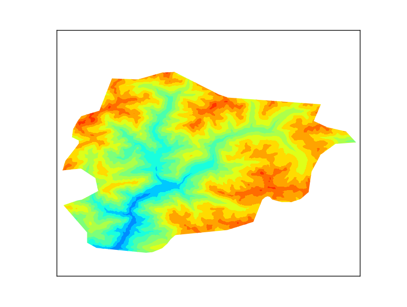
    A shaded relief image simulates the shadow thrown upon a relief map. This shadow is usually blended with some colouring, related to the altitude, a terrain classification, etc.
    The shadow is usually drawn considering that the sun is at 315 degrees of azimuth and 45 degrees over the horizon, which never happens at the north hemisphere. This values avoid strange perceptions, such as seeing the mountain tops as the bottom of a valley.

    In this example, the script calculates the hillshade image, a coloured image, and blends them into the shaded relief image.

    As usual, all the code, plus the sample DEM file, can be found at GitHub.

    The hillshade image

    I didn't know how to create a shaded relief image using numpy. Eric Gayer helped me with some samples, and I found some other information here.
    The script is:
    """
    Creates a shaded relief file from a DEM.
    """
    
    from osgeo import gdal
    from numpy import gradient
    from numpy import pi
    from numpy import arctan
    from numpy import arctan2
    from numpy import sin
    from numpy import cos
    from numpy import sqrt
    from numpy import zeros
    from numpy import uint8
    import matplotlib.pyplot as plt
    
    def hillshade(array, azimuth, angle_altitude):
            
        x, y = gradient(array)
        slope = pi/2. - arctan(sqrt(x*x + y*y))
        aspect = arctan2(-x, y)
        azimuthrad = azimuth*pi / 180.
        altituderad = angle_altitude*pi / 180.
         
     
        shaded = sin(altituderad) * sin(slope)\
         + cos(altituderad) * cos(slope)\
         * cos(azimuthrad - aspect)
        return 255*(shaded + 1)/2
    
    ds = gdal.Open('w001001.tiff')  
    band = ds.GetRasterBand(1)  
    arr = band.ReadAsArray()
    
    hs_array = hillshade(arr,315, 45)
    plt.imshow(hs_array,cmap='Greys')
    plt.show()

    • The script draws the image using matplotlib, to make it easy
    • The hillshade function starts calculating the gradient for the x and y directions using the numpy.gradient function. The result are two matrices of the same size than the original, one for each direction.
    • From the gradient, the aspect and slope can be calculated. The aspect will give the mountain orientation, which will be illuminated depending on the azimuth angle. The slopewill change the illumination depending on the altitude angle.
    • Finally, the hillshade is calculated.

     shaded_relief.py

     The shaded relief image is calculated using the algorithm explained in the post Colorize PNG from a raster file and the hillshade.
    As in the coloring post, the image is read by blocks to improve the performance, because it uses a lot of arrays, and doing it at once with a big image can take a lot of resources.
    I will coment the code block by block, to make it easier. The full code is here.

    The main function, called shaded_relief, is the most important, and calls the different algorithms:
    def shaded_relief(in_file, raster_band, color_file, out_file_name,
        azimuth=315, angle_altitude=45):
        '''
        The main function. Reads the input image block by block to improve the performance, and calculates the shaded relief image
        '''
    
        if exists(in_file) is False:
                raise Exception('[Errno 2] No such file or directory: \'' + in_file + '\'')    
        
        dataset = gdal.Open(in_file, GA_ReadOnly )
        if dataset == None:
            raise Exception("Unable to read the data file")
        
        band = dataset.GetRasterBand(raster_band)
    
        block_sizes = band.GetBlockSize()
        x_block_size = block_sizes[0]
        y_block_size = block_sizes[1]
    
        #If the block y size is 1, as in a GeoTIFF image, the gradient can't be calculated, 
        #so more than one block is used. In this case, using8 lines gives a similar 
        #result as taking the whole array.
        if y_block_size < 8:
            y_block_size = 8
    
        xsize = band.XSize
        ysize = band.YSize
    
        max_value = band.GetMaximum()
        min_value = band.GetMinimum()
    
        #Reading the color table
        color_table = readColorTable(color_file)
        #Adding an extra value to avoid problems with the last & first entry
        if sorted(color_table.keys())[0] > min_value:
            color_table[min_value - 1] = color_table[sorted(color_table.keys())[0]]
    
        if sorted(color_table.keys())[-1] < max_value:
            color_table[max_value + 1] = color_table[sorted(color_table.keys())[-1]]
        #Preparing the color table
        classification_values = color_table.keys()
        classification_values.sort()
    
        max_value = band.GetMaximum()
        min_value = band.GetMinimum()
    
        if max_value == None or min_value == None:
            stats = band.GetStatistics(0, 1)
            max_value = stats[1]
            min_value = stats[0]
    
        out_array = zeros((3, ysize, xsize), 'uint8')
    
        #The iteration over the blocks starts here
        for i in range(0, ysize, y_block_size):
            if i + y_block_size < ysize:
                rows = y_block_size
            else:
                rows = ysize - i
            
            for j in range(0, xsize, x_block_size):
                if j + x_block_size < xsize:
                    cols = x_block_size
                else:
                    cols = xsize - j
    
                dem_array = band.ReadAsArray(j, i, cols, rows)
                
                hs_array = hillshade(dem_array, azimuth, 
                    angle_altitude)
    
                rgb_array = values2rgba(dem_array, color_table, 
                    classification_values, max_value, min_value)
    
                hsv_array = rgb_to_hsv(rgb_array[:, :, 0], 
                    rgb_array[:, :, 1], rgb_array[:, :, 2]) 
    
                hsv_adjusted = asarray( [hsv_array[0], 
                    hsv_array[1], hs_array] )          
    
                shaded_array = hsv_to_rgb( hsv_adjusted )
                
                out_array[:,i:i+rows,j:j+cols] = shaded_array
        
        #Saving the image using the PIL library
        im = fromarray(transpose(out_array, (1,2,0)), mode='RGB')
        im.save(out_file_name)
    • After opening the file, at line 20 comes the first interesting point. If the image is read block by block, some times the blocks will have only one line, as in the GeoTIFF images. With this situation, the y gradient won't be calculated, so the hillshade function will fail. I've seen that taking only two lines gives coarse results, and with lines the result is more or less the same as taking the whole array. The performance won't be as good as using only one block, but works faster anyway.
    • Lines 32 to 51 read the color table and file maximim and minumum. This has to be outside the values2rgba function, since is needed only once.
    • Lines 54 to 66 control the block reading. For each iteration, a small array will be read (line 67). This is what will be processed. The result will be written in the output array defined at line 52, that has the final size.
    • Now the calculations start:
      • At line 69, the hillshade is calculated
      • At line 72, the color array is calculated
      • At line 75, the color array is changed from rgb values to hsv. 
      • At line 78, the value (the v in hsv) is changed to the hillshade value. This will blend both images. I took the idea from this post.
      • Then the image is transformed to rgb again (line 81) and written into the output array (line 83)
    • Finally, the array is transformed to a png image using the PIL library. The numpy.transpose function is used to re-order the matrix, since the original values are with the shape (3, height, width), and the Image.fromarray function needs (height, width, 3). An other way to do this is using scipy.misc.imsave (that would need scipy installed just for that), or the Image.merge function.

    The colouring funcion is taken from the post  Colorize PNG from a raster file, but modifying it so the colors are only continuous, since the discrete option doesn't give nice results in this case:
    def values2rgba(array, color_table, classification_values, max_value, min_value):
        '''
        This function calculates a the color of an array given a color table. 
        The color is interpolated from the color table values.
        '''
        rgba = zeros((array.shape[0], array.shape[1], 4), dtype = uint8)
    
        for k in range(len(classification_values) - 1):
            if classification_values[k] < max_value and (classification_values[k + 1] > min_value ):
                mask = logical_and(array >= classification_values[k], array < classification_values[k + 1])
    
                v0 = float(classification_values[k])
                v1 = float(classification_values[k + 1])
    
                rgba[:,:,0] = rgba[:,:,0] + mask * (color_table[classification_values[k]][0] + (array - v0)*(color_table[classification_values[k + 1]][0] - color_table[classification_values[k]][0])/(v1-v0) )
                rgba[:,:,1] = rgba[:,:,1] + mask * (color_table[classification_values[k]][1] + (array - v0)*(color_table[classification_values[k + 1]][1] - color_table[classification_values[k]][1])/(v1-v0) )
                rgba[:,:,2] = rgba[:,:,2] + mask * (color_table[classification_values[k]][2] + (array - v0)*(color_table[classification_values[k + 1]][2] - color_table[classification_values[k]][2])/(v1-v0) )
                rgba[:,:,3] = rgba[:,:,3] + mask * (color_table[classification_values[k]][3] + (array - v0)*(color_table[classification_values[k + 1]][3] - color_table[classification_values[k]][3])/(v1-v0) )
        return rgba
       
    The hillshade function is the same explained at the first point
    The functions rgb_to_hsv and hsv_to_rgb are taken from this post, and change the image mode from rgb to hsv and hsv to rgb.

    Links

    Tuesday, February 25, 2014

    3D terrain visualization with python and Mayavi2

    I have always wanted to draw these 3D terrains like those in www.shadedrelief.com, which are amazing. But the examples were all using software I don't use, so I tried to do it with python.
    The final result


    As usual, you can get all the source code and data at my GitHub page.

     Getting the data

    After trying different locations, I decided to use the mountain of Montserrat, close to Barcelona, since it has nice stone towers that are a good test for the DEM and the 3D visualization. An actual picture of the zone used is this one:
    Montserrat monastery
    The building is a good reference, since the stone only areas make the result testing much more difficult.
    All the data has been downloaded from the ICGC servers:
    • The DEM data was downloaded from the Vissir3 service, going to the section catàleg i descàrregues -> MDE 5x5. The file is named met5v10as0f0392Amr1r020.txt, but I cut a small part of it, to make mayavi2 work smoother using:

      gdalwarp -te 401620 4604246 403462 4605867 -s_srs EPSG:25831 -t_srs EPSG:25831 met5v10as0f0392Amr1r020.txt dem.tiff
    • The picture to drap over the dem file can be downloaded using the WMS service given by the ICGC:

      http://geoserveis.icc.cat/icc_mapesbase/wms/service?REQUEST=GetMap&VERSION=1.1.0&SERVICE=WMS&SRS=EPSG:25831&BBOX=401620.0,4604246.0,403462.0,4605867.0&WIDTH=1403&HEIGHT=1146&LAYERS=orto5m&STYLES=&FORMAT=JPEG&BGCOLOR=0xFFFFFF&TRANSPARENT=TRUE&EXCEPTION=INIMAGE
     It's not as automatic as I would like, but if it's possible to download a DEM and the corresponding image, it's possible to create the 3D image.

    Creating the image

    First, let's plot the DEM file in 3D using mayavi2:
    """
    Plotting the terrain DEM with Mayavi2
    """
    
    from osgeo import gdal
    from mayavi import mlab
    
    ds = gdal.Open('dem.tiff')
    data = ds.ReadAsArray()
    
    mlab.figure(size=(640, 800), bgcolor=(0.16, 0.28, 0.46))
    
    mlab.surf(data, warp_scale=0.2) 
    
    mlab.show()
    • In first place, we import as usual, gdal and numpy. Also the mlab library from mayavi, which lets set the mayavi canvas.
    • The data is read, as usual, with the gdal ReadAsArray method. 
    • The figure is created. This works like creating the Image object in the PIL library, creating the canvas where the data wil be drawn. In this case, the size is 640 x 800 pixels, making the figure bigger can affect the performance in some old computers. bgcolor sets the blue color as the background.
    • The surf method will plot the surface. The input has to be a 2D numpy array, which is what we have.  
      • The warp_scale argument sets the vertical scale. In this case, letting the default value (1?) creates a really exaggerated effect so its better to play a little to get a more realistic effect.
      • The colors depend of the Z value at each point, and can be changed using the color or colormap option.
    • The show() method makes the image to stay visible when running the example from a script. If you use ipython, you don't need this step.
    • If you want to save the figure as a png, you can either use the icon in the mayavi window or call the method mlab.savefig('image_name')
    • If you want to move the camera (change the prespective), you can use the roll/yaw/pitch methods:
      f = mlab.gcf()
      camera = f.scene.camera
      camera.yaw(45)

    The plotted DEM
    Now, let's put an aerial image over the 3D visualization:
    """
    Draping an image over a terrain surface
    """
    from osgeo import gdal
    from tvtk.api import tvtk
    from mayavi import mlab
    import Image
    
    ds = gdal.Open('dem.tiff')
    data = ds.ReadAsArray()
    im1 = Image.open("ortofoto.jpg")
    im2 = im1.rotate(90)
    im2.save("/tmp/ortofoto90.jpg")
    bmp1 = tvtk.JPEGReader()
    bmp1.file_name="/tmp/ortofoto90.jpg" #any jpeg file
    
    my_texture=tvtk.Texture()
    my_texture.interpolate=0
    my_texture.set_input(0,bmp1.get_output())
    
    
    mlab.figure(size=(640, 800), bgcolor=(0.16, 0.28, 0.46))
    
    surf = mlab.surf(data, color=(1,1,1), warp_scale=0.2) 
    surf.actor.enable_texture = True
    surf.actor.tcoord_generator_mode = 'plane'
    surf.actor.actor.texture = my_texture
    
    mlab.show()

    • The most important new import is tvtk. TVTK is a python api that allows to work with VTK objects. Actually, my knowledge of Mayavi2 is very limited, but I see TVTK as an extension.
    • The DEM data is read the same way, using the ReadAsArray method.
    • The aerial image, named ortofoto.jpg, is not in the correct orientation. It took me a lot of time to get what was happening. I rotate it opening the image with the PIL library and using the rotate method (lines 11 to 13)
    • Then, the tvtk object with the texture is created, loading the image with a JPEGReader object, and assigning it to the Texture object (lines 14 to 19). 
    • The figure and the 3D surface is created as in the other example (lines 22 and 24)
    • Then, the surface is modified to show the image over it (lines 25 to 28). 
    The final result

    The result is correct, but the aerial image is a little moved from the place it should be so, since the terrain is really steep, part of the buildings are drawn on the stone walls! I edited the WMS coordinates a little so the result is slightly better. Anyway, the method is correct.

    Links

    • GitHub: The source code and example data
    • Mayavi2: 3D scientific data visualization and plotting 
    • This entry to a mailing list gave me the tip to create the example
    • If you want to do more or less the same, but using JavaScript, Bjørn Sandvik posted this excellent example.
    • ShadedRelief: Cool 3D and shaded relief examples.

    Saturday, January 18, 2014

    D3 map Styling tutorial III: Drawing animated paths

    The example La Belle France, or the original La Bella Italia by Gregor Aisch, have a nice ferry sailing along a path to connect the islands with the continent.
    Drawing a path in a map, and animating some icon on it can be a nice tool to show information about routes, storm tracks, and other dynamic situations.
    http://bl.ocks.org/rveciana/8464690

    This example shows how to draw the Haiyan typhoon track on the map drawn in the last post.

    The working examples are here:
    Creating a geopath
    Animating an object on the path

    Getting the data

    Both the base map data and the typhoon data are explained in the post  D3 map Styling tutorial I: Preparing the data

    Creating a geopath

    First, how to draw the path line on a map. The working example is here.


    • The base map is drawn in the simplest way, as shown in this example, so the script stays clearer.
    • The typhoon track is loaded from the json file generated in the first tutorial post (line 55)
    • The path is created and inserted from lines 68 to 75:
      • A d3.svg.line element is created. This will interpolate a line between the points. An other option is to draw segments from each point, so the line is not so smooth, but the actual points are more visible. 
        • The interpolate method sets the interpolation type to be used.
        • x and y methods, set the svg coordinates to be used. In our case, we will transform the geographical coordinates using the same projection function set for the map. The coordinates transformation is done twice, one for the x and another for the y. It would be nice to do it only once.
      • The path is added to the map, using the created d3.svg.line, passing the track object as a parameter to be used by the line function. The class is set to path, so is set to a dashed red line (line 20)
    Drawing the paths is quite easy, taking only two steps.

    Animating an object on the path


    The typhoon position for every day is shown on the path, with an icon. The icon size and color change with the typhoon class. The working example is here.


    This second example is more complex than the first one:
    • The base map has a shadow effect. See the second part of the tutorial for the source.
    • The map is animated:
      • Line 135 sets an interval, so the icon and line can change with the date.
      • A variable i is set, so the array elements are used in every interval.
      • When the dates have ended, the interval is removed, so everything stays quiet. Line 158.
    • An icon moves along the path indicating the position of the typhoon
      •  Line 128 created the icon. First, I created it using inkscape, and with the xml editor that comes with it, I copied the path definition. This method can get really complex with bigger shapes.
      • Line 136 finds the position of the typhoon. The length of the track is found at line 122 with the getTotalLength() method.
      • Line 137 moves the icon. A transition is set, so the movement is continuous even thought the points are separated. The duration is the same as the interval, so when the icon has arrived at the final point, a new transformation starts to the next one.
      • Line 141 has the transform operation that sets the position (translate), the size (scale) and rotation (rotate). The factors multiplying the scale and rotation are those only to adjust the size and rotation speed. They are completely arbitrary.
    • The path gets filled when the icon has passed. I made this example to learn how to do it. Everything happens at line 144. Basically, the trick is creating a dashed line, and playing with the stroke-dashoffset attribute to set where the path has to arrive.
    • The color of the path and icon change with the typhoon class
      • At line 54, a color scale is created using the method d3.scale.quantile
        • The colors are chosen with colorbrewer, which is a set of color scales for mapping, and has a handy javascript library to set the color scales just by choosing their name. I learned how to use it with this example by Mike Bostock.
      • The lines 156 and 142 change the track and icon colours.
    • Finally, at line 154, the date is changed, with the same color as the typhoon and track.

    Links

    Simple path on a map - The first example
    Haiyan typhoon track - The second example
    D3 map Styling tutorial I: Preparing the data
    D3 map Styling tutorial II: Giving style to the base map
    Animated arabic kufic calligraphy with D3 - Animating paths using d3js
    La Bella Italia - Kartograph example by Gregor Aisch
    La Belle France - The same example as La Bella Italia, but using D3js
    Every ColorBrewer Scale - An example to learn how to use ColorBrewer with D3js

    Saturday, January 4, 2014

    D3 map Styling tutorial II: Giving style to the base map


    The example La Belle France, or the original La Bella Italia by Gregor Aisch use svg filters to give style to the maps. I haven't found many examples about how to do it, so I will explain here two different styles: a simple shadow under the map, and a style similar to the original map.

    As usual, the examples can be seen at my bl.ocks.org page:
    Drop shadow
    LaBella Italia

    SVG filters basics

    SVG can style the elements by using css or css-like attributes, like the color, the stroke, and so on. But it's possible to use filters to add efects such as blurring, dilating the shapes, adding lights... This, of course, can be used to change the map polygons too.

    A basic usage of an SVG filter is like this:


    And the result is:
    Note that:

    • The shape (a rectangle defined by the rect tag) is drawn as usual
    • The filter is defined with the filter tag inside the defs section. The filter must have an id to be used in the geometries where it has to be used
    • The filter is applied to the rectangle by using the filter="url(#blur)" attribute, where the id of the filter is added as url(#name_of_the_filter)
    This is the easiest filter an SVG can have, but filters can concatenate different effects one after the other or in parallel, as we will see in the following examples. 
    A list of all the effects and a tutorial can be found at W3C Schools

    Simple shadow

    The drop shadow effect gives a quite nice look to the maps and it's fast to process by the browser and easy to code. I took the code from this example.

    The map shown in the last post with the effect. The code:


    Note that the filter (lines 46 to 66) has several parts:

    • The filter is defined adding a defs tag and appending the filter, with an id and a height tags. The height is added to affect the region outside the geometry. It's not actually necessary in this case, but I kept it to maintain the example code.
    • An feGaussianBlur is then appended (line 50). The in attribute indicates that the input image for the filter is the alpha value of the input image, so if the map is colored in red, the shadow will remain grey. stdDeviation indicates the filter intensity, and output gives an id to use the resulting image, as we will see.
    • Line 55 adds an feOffset filter, that will move the shadow. The dx and dy attributes define how to move the shadow, but the important attribute here is the in, that takes the id defined in the feGaussianBlur tag, so what is moved is the blurred image. Again, an out attribute is defined to use the result image later.
    • Line 61 defines an feMerge tag. This is an interesting property of svg filters that allow to append different filter results one over the other to create more complex outputs. Appended to the tag, an feMergeNode is added at line 63 with the blurred image at the in attribute. At line 65, the original image is appended over the blurred image, with an other feMergeNode tag, with the in attr set to SourceGraphic to indicate the original image.
    SVG filters seemed quite dificult to me, but they are actually a kind of instructions one after the other, written in XML.

    Styling like La Bella Italia

    As it was shown in the post, the filters part of La Bella Italia map is quite complicated. I'll try to show an easy way to get a similar effect. 
    Disclaimer: In my old computer, generating these maps is very slow, so maybe it would be better to think about another combination to create cool maps without using the erode and dilate filters.

    The map without any effect looks like this:
    And the effect has three stacked parts (I'll paste only the part of the code affecting each part, the whole code is here):

    1. A colouring and blurring
      To do it:
      filter.append("feColorMatrix")
          .attr("in","SourceGraphic")
          .attr("type", "matrix")
          .attr("values", "0 0 0 0 0.6 0 0 0 0 0.5333333333333333 0 0 0 0 0.5333333333333333  0 0 0 1 0")
          .attr("result","f1coloredMask");
      filter.append("feGaussianBlur")
        .attr("in", "f1coloredMask")
        .attr("stdDeviation", 15)
        .attr("result", "f1blur");
      So there are two concatenated actions. The first one, feColorMatrix, changes the color of the original image (see how here). The second, blurs it as in the first example.
    2. Eroding, coloring, blurring and composing:
      filter.append("feColorMatrix")
          .attr("in","SourceGraphic")
          .attr("type", "matrix")
          .attr("values", "0 0 0 0 0   0 0 0 0 0   0 0 0 0 0   0 0 0 500 0")
          .attr("result","f2mask");
      filter.append("feMorphology")
          .attr("in","f2mask")
          .attr("radius","1")
          .attr("operator","erode")
          .attr("result","f2r1");
      filter.append("feGaussianBlur")
          .attr("in","f2r1")
          .attr("stdDeviation","4")
          .attr("result","f2r2");
      filter.append("feColorMatrix")
          .attr("in","f2r2")
          .attr("type", "matrix")
          .attr("values", "1 0 0 0 0.5803921568627451 0 1 0 0 0.3607843137254902 0 0 1 0 0.10588235294117647 0 0 0 -1 1")
          .attr("result","f2r3");
      filter.append("feComposite")
          .attr("operator","in")
          .attr("in","f2r3")
          .attr("in2","f2mask")
          .attr("result","f2comp");
      This one is more complicated. 
      1. The first step changes the map color into black, with an alpha value of 0.5. This output will be used in the second and last step.
      2. Then, using the first output, the image is eroded. That is, the land gets smaller by one pixel, using feMorphology with the erode operator. Then, the result is blurred using feGaussianBlur, and coloured as in the first filter.
      3. The resulting image is composited with the original black and white image, using feComposite. The definition of this operator, taken from here, is:
        The result is the part of A that is within the boundaries of B. Don't confuse the name of this attribute value with the in attribute.
    3. The two effects are stacked, and the original map is added at the end:
      var feMerge = filter.append("feMerge");
      
      feMerge.append("feMergeNode")
          .attr("in", "f1blur");
      feMerge.append("feMergeNode")
          .attr("in", "f2comp");
      feMerge.append("feMergeNode")
          .attr("in", "SourceGraphic");
      This part is simple,the feMerge stacks all the outputs indicated in the feMergeNode tags. So in this case, the blurred image goes in the first place, then the eroded one, and finally, the original one. Now, the effect seems quite a lot to the one in La Bella Italia.

    Links

    Drop shadow map - The first example
    La Bella Italia like map - The second example
    D3 map Styling tutorial I: Preparing the data - First part of the tutorial
    La Bella Italia - Kartograph example by Gregor Aisch
    La Belle France - The same example as La Bella Italia, but using D3js
    d3.js drop shadow example - SVG drop shadow filter by Charl P. Botha
    SVG filters tutorial - W3C Schools tutorial about SVG filters