Showing posts with label OGR. Show all posts

Saturday, August 16, 2014

Shortest distance to a geometry in a specified direction using Python

Looking at this map, I wondered how to calculate which geometry in a set is the closest to a point in a given direction.  
Usually, the problem is finding the closest geometry in general, which is easy using the distance function, but I couldn't find a solution for this other.

So I put me this problem: Which is the closest country that I have at each direction, knowing my geographical coordinates?
All the source code is, as usual, at GitHub

  The algorithm

The main idea is:
  1. Create an infinite line from the point towards the desired direction.
  2. Calculate the difference geometry between the  line and each polygon
    1. If the polygon and the line actually intersect, the result will be a multi-line. The first line length of the multi-line is the distance we are looking for
So this would be the initial situation:
 And the distance to the polygon 1 would be calculated as:
The main problem is how to calculate the difference between the two geometries, but fortunately, shapely comes with this function, so coding it is not so difficult:
from shapely.geometry import Polygon
from shapely.geometry import LineString
from math import cos
from math import sin
from math import pi

def closest_polygon(x, y, angle, polygons, dist = 10000):
  
    angle = angle * pi / 180.0
    line = LineString([(x, y), (x + dist * sin(angle), y + dist * cos(angle))])

    dist_min = None
    closest_polygon = None
    for i in range(len(polygons)):
        difference = line.difference(polygons[i])
        if difference.geom_type == 'MultiLineString':
            dist = list(difference.geoms)[0].length
            if dist_min is None or dist_min > dist:
                dist_min = dist
                closest_polygon = i


    return {'closest_polygon': closest_polygon, 'distance': dist_min}


if __name__ == '__main__':

    polygons = []
    polygons.append(Polygon([(4, 2), (4, 4), (6, 4), (6, 2)]))
    polygons.append(Polygon([(7, 2), (7, 4), (9, 4), (9, 2)]))
   
    
    print closest_polygon(3, 3, 90, polygons)
  • The main section creates the two squares using shapely
  • The closest_polygon function calculates the closest polygon and its distance:
    • A LineString to the desired direction is calculated. The dist is in the units used by the polygons. An infinite line isn't possible, so the distance must be larger than the further
    • For each of the polygons to analyze, the difference is calculated using the shapely difference method
    • Then, if the line and the polygon intersect (and the line is long enough), a MultilineString will be the result of the difference operation. The first String in the MultilineString is the one that connects our point with the polygon. Its length is the distance we are looking for
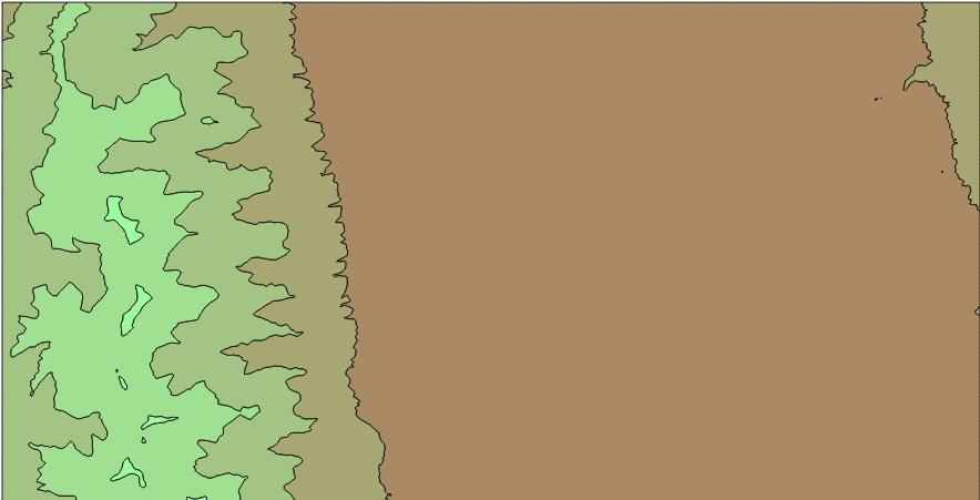
The example schema, drawn with the script draw_closest.py


Calculating the closest country in each direction

After getting the formula for calculating the closest polygon, the next step would be using it for something. So:
Which country do I have in all directions?
To create the script, some things have to be considered:
  1. The projection should be azimuthal equidistant so the distances can be compared in all the directions from the given point
  2. I've used the BaseMap library to draw the maps. I find it a bit tricky to use, but the code will be shorter
The script is used this way:

usage: closest_country.py [-h] [-n num_angles] [-o out_file] [-wf zoom_factor]
                          lon lat

Creates a map with the closest country in each direction

positional arguments:
  lon              The point longitude
  lat              The point latitude

optional arguments:
  -h, --help       show this help message and exit
  -n num_angles    Number of angles
  -o out_file      Out file. If present, saves the file instead of showing it
  -wf zoom_factor  The width factor. Use it to zoom in and out. Use > 1 to
                   draw a bigger area, and <1 for a smaller one. By default is
                   1


For example:
python closest_country.py -n 100 -wf 2.0 5 41
The code has some functions, but the main one is draw_map:
def draw_map(self, num_angles = 360, width_factor = 1.0):

        #Create the map, with no countries
        self.map = Basemap(projection='aeqd',
                    lat_0=self.center_lat,lon_0=self.center_lon,resolution =None)
        #Iterate over all the angles:
        self.read_shape()
        results = {}
        distances = []
        for num in range(num_angles):
            angle = num * 360./num_angles
            closest, dist = self.closest_polygon(angle)
            if closest is not None:
                distances.append(dist)
                if (self.names[closest] in results) == False:
                    results[self.names[closest]] = []

                results[self.names[closest]].append(angle)
        
        #The map zoom is calculated here, 
        #taking the 90% of the distances to be drawn by default       
        width = width_factor * sorted(distances)[
                int(-1 * round(len(distances)/10.))]

        #Create the figure so a legend can be added
        plt.close()
        fig = plt.figure()
        ax = fig.add_subplot(111)
        cmap = plt.get_cmap('Paired')
        
       
        self.map = Basemap(projection='aeqd', width=width, height=width,
                    lat_0=self.center_lat,lon_0=self.center_lon,resolution =None)
        self.read_shape()
        
        #Fill background.
        self.map.drawmapboundary(fill_color='aqua')

        #Draw parallels and meridians to give some references
        self.map.drawparallels(range(-80, 100, 20))
        self.map.drawmeridians(range(-180, 200, 20))

           
        #Draw a black dot at the center.
        xpt, ypt = self.map(self.center_lon, self.center_lat)
        self.map.plot([xpt],[ypt],'ko')
    
        #Draw the sectors
        for i in range(len(results.keys())):
            for angle in results[results.keys()[i]]:
                anglerad = float(angle) * pi / 180.0
                anglerad2 = float(angle + 360./num_angles) * pi / 180.0
                polygon = Polygon([(xpt, ypt), (xpt + width * sin(anglerad), ypt + width * cos(anglerad)), (xpt + width * sin(anglerad2), ypt + width * cos(anglerad2))])
                patch2b = PolygonPatch(polygon, fc=cmap(float(i)/(len(results) - 1)), ec=cmap(float(i)/(len(results) - 1)), alpha=1., zorder=1)
                ax.add_patch(patch2b)
        

        #Draw the countries
        for polygon in self.polygons:
            patch2b = PolygonPatch(polygon, fc='#555555', ec='#787878', alpha=1., zorder=2)
            ax.add_patch(patch2b)

        #Draw the legend
        cmap = self.cmap_discretize(cmap, len(results.keys()))
        mappable = cm.ScalarMappable(cmap=cmap)
        mappable.set_array([])
        mappable.set_clim(0, len(results))
        colorbar = plt.colorbar(mappable, ticks= [x + 0.5 for x in range(len(results.keys()))])
        colorbar.ax.set_yticklabels(results.keys())

        plt.title('Closest country')

  • The first steps are used to calculate  the closest country in each direction, storing the result in a dict. The distance is calculated using the closest_polygon method, explained in the previous section..
  • The actual map size is then calculated, taking the distance where the 90% of the polygons will appear. The width_factor can change this, because some times the result is not pretty enough. Some times has to much zoom and some, too few. Note that the aeqd i.e., Azimuthal Equidistant projection is used, since is the one that makes the distances in all directions comparable.
  • Next steps are to actually drawing the map
    • The sectors (the colors indicating the closest country) are drawn using the Descartes library and it's PolygonPatch
    • The legend needs to change the color map to a discrete color map. I used a function called cmap_discretize, found here, to do it
    • The legend is created using the examples found in this cookbook
Some outputs:


Next steps: What's across the ocean

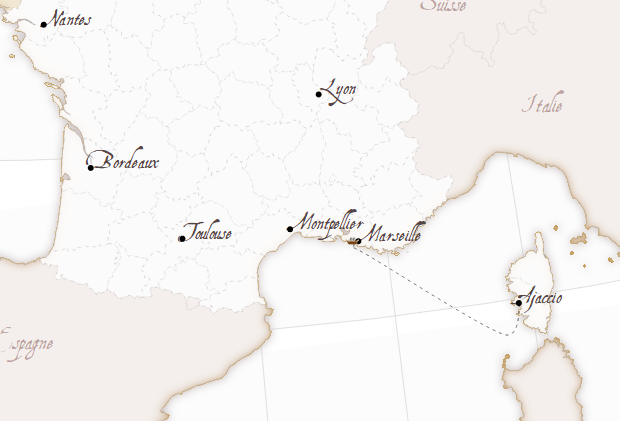
Well, my original idea was creating a map like this one, showing the closest country when you are at the beach. Given a point and a direction (east or west in the example), calculating the country is easy, and doing it for each point in the coast is easy too. The problem is that doing it automatic is far more difficult, since you have to know the best direction (not easy in many places like islands), which countries to take as the origin, etc.
An other good thing would be doing the same, but with d3js, since  the point position could become interactive. I found some libraries like shapely.js or  jsts, but I think that they still don't implement the difference operation that we need.

Links 

Tuesday, December 3, 2013

La Belle France - Map styling with D3js

When I looked to the vectorial web mapping tools for the first time, I was completely carried away by this example made with Kartograph by the software creator Gregor Aisch.
This example was, actually, the reason I learned Kartograph and published some posts here.
Later, I learned D3js, which was also amazing, but I didn't find a map like La Bella Italia. So I tried to do a similar one myself.

See the working web 
To make the map, I had to reproduce a the result of the Kartograph example to understand how the effects were achieved. Then, get some base data to make the map, and finally, code the example.

Getting the data

The map has, basically, data about the land masses, the countries and the French regions.
I tried data from different places (one of them, Eurostat, that ended in this example), until I decided to use the Natural Earth data. After some attempts, I decided to use the 1:10m data. The files are:

  1. ne_10m_admin_0_countries.shp, clipped using:
    ogr2ogr -clipsrc -10 35 15 60 countries.shp ne_10m_admin_0_countries.shp
  2. ne_10m_admin_1_states_provinces.shp, clipped using:
    ogr2ogr -clipsrc -10 35 15 60 -where "adm0_a3 = 'FRA'" regions.shp ne_10m_admin_1_states_provinces.shp
  3. ne_10m_land.shp, downloaded from github, since the official version gave errors when converted to TopoJSON. Clipped using:
    ogr2ogr -clipsrc -10 35 15 60  land.shp ne_10m_land.shp
With that, the land, countries and regions are available. To merge them into a single TopoJson file, I used:
topojson -o ../data.json countries.shp regions.shp

The html code

Since the code is quite long, and I think that I will made some more posts about specific parts of the technique, the comments are a bit shorter than usually.

CSS

Note how is the font AquilineTwo.ttf  loaded:
@font-face {
    font-family: 'AquilineTwoRegular';
    src: url('AquilineTwo-webfont.eot');
    src: url('AquilineTwo-webfont.eot?#iefix') format('embedded-opentype'),
         url('AquilineTwo-webfont.woff') format('woff'),
         url('AquilineTwo-webfont.ttf') format('truetype'),
         url('AquilineTwo-webfont.svg#AquilineTwoRegular') format('svg');
    font-weight: normal;
    font-style: normal;

}

Later, the font can be set using .attr("font-family","AquilineTwoRegular")

Loading the layers

To achieve the effects, some layers are loaded more than one time, so different filters can be applied to get the shades and blurred borders:
svg.selectAll(".bgback")
    .data(topojson.feature(data, data.objects.land).features)
  .enter()
    .append("path")
      .attr("class", "bgback")
      .attr("d", path)
      .style("filter","url(#oglow)")
      .style("stroke", "#999")
      .style("stroke-width", 0.2);
In this case, the land masses are drawn, applying the effect named oglow, which looks like:
var oglow = defs.append("filter")
  .attr("id","oglow");
  oglow.append("feColorMatrix")
    .attr("in","SourceGraphic")
    .attr("type", "matrix")
    .attr("values", "0 0 0 0 0   0 0 0 0 0   0 0 0 0 0   0 0 0 1 0")
    .attr("result","mask");
  oglow.append("feMorphology")
    .attr("in","mask")
    .attr("radius","1")
    .attr("operator","dilate")
    .attr("result","mask");
  oglow.append("feColorMatrix")
    .attr("in","mask")
    .attr("type", "matrix")
    .attr("values", "0 0 0 0 0.6 0 0 0 0 0.5333333333333333 0 0 0 0 0.5333333333333333  0 0 0 1 0")
    .attr("result","r0");
  oglow.append("feGaussianBlur")
    .attr("in","r0")
    .attr("stdDeviation","4")
    .attr("result","r1");
  oglow.append("feComposite")
    .attr("operator","out")
    .attr("in","r1")
    .attr("in2","mask")
    .attr("result","comp");
To see how svg filters work, many pages are available. I got them looking at the Kartograph example generated html.

Adding the labels

The labels aren't inside the TopoJSON (although they could be!), so I decided the labels to add and put them into an array:
var cities = [ 
                {'pos': [2.351, 48.857], 'name': 'Paris'},
                {'pos':[5.381, 43.293], 'name': 'Marseille'},
                {'pos':[3.878, 43.609], 'name': 'Montpellier'},
                {'pos':[4.856, 45.756], 'name': 'Lyon'}, 
                {'pos':[1.436, 43.602], 'name': 'Toulouse'},
                {'pos':[-0.566, 44.841], 'name': 'Bordeaux'},
                {'pos':[-1.553, 47.212], 'name': 'Nantes'},
                {'pos':[8.737, 41.925], 'name': 'Ajaccio'},
              ];
Then, adding them to the map is easy:
var city_labels =svg.selectAll(".city_label")
    .data(cities)
    .enter();

  city_labels
    .append("text")
    .attr("class", "city_label")
    .text(function(d){return d.name;})
    .attr("font-family", "AquilineTwoRegular")
    .attr("font-size", "18px")
    .attr("fill", "#544")
    .attr("x",function(d){return projection(d.pos)[0];})
    .attr("y",function(d){return projection(d.pos)[1];});


  city_labels
    .append("circle")
    .attr("r", 3)
    .attr("fill", "black")
    .attr("cx",function(d){return projection(d.pos)[0];})
    .attr("cy",function(d){return projection(d.pos)[1];});
Note that the positions must be calculated transforming the longitude and latitude using the d3js projection functions.

The ship

To draw the ship, tow things are necessary, the path and the ship.
To draw the path:
var ferry_path = [[8.745, 41.908],
                  [8.308, 41.453],
                  [5.559, 43.043], 
                  [5.268, 43.187], 
                  [5.306, 43.289]
                  ];
  var shipPathLine = d3.svg.line()
    .interpolate("cardinal")
    .x(function(d) { return projection(d)[0]; })
    .y(function(d) { return projection(d)[1]; });

  var shipPath = svg.append("path")
    .attr("d",shipPathLine(ferry_path))
    .attr("stroke","#000")
    .attr("class","ferry_path");
Basically, d3.svg.line is used to interpolate the points, making the line smoother. This is easier than the Kartograph way with geopaths, where the Bézier control points have to be calculated. d3.svg.line is amazing, more than what I thought before.
I don't know if the way to calculate the projected points is the best one, since I do it twice for each point, which is ugly.
To move the ship, a ship image is appended, and then moved with a setInterval:
  var shipPathEl = shipPath.node();
  var shipPathElLen = shipPathEl.getTotalLength();

  var pt = shipPathEl.getPointAtLength(0);
  var shipIcon = svg.append("image")
          .attr("xlink:href","ship.png")
          .attr("x", pt.x - 10)
          .attr("y", pt.y - 5.5)
          .attr("width", 15)
          .attr("height", 8);

  var i = 0;
  var delta = 0.05;
  var dist_ease = 0.2;
  var delta_ease = 0.9;
  setInterval(function(){
    
    pt = shipPathEl.getPointAtLength(i*shipPathElLen);
    shipIcon
      .transition()
      .ease("linear")
      .duration(1000)
      .attr("x", pt.x - 10)
      .attr("y", pt.y - 5.5);
    
    //i = i + delta;

    if (i < dist_ease){
      i = i + delta * ((1-delta_ease) + i*delta_ease/dist_ease);
    }else if (i > 1 - dist_ease){
      i = i + delta * (1 - ((i - (1 - dist_ease)) * (delta_ease/dist_ease)));
    }else{
      i = i + delta;
    }
    if (i+0.0001 >= 1 || i-0.0001 <= 0)
      delta = -1 * delta;
  },1000);
The ship position is calculated every second, and moved with a d3js transition to make it smooth (calculating everything more often didn't give this smooth effect)
The speed of the ship is changed depending on the proximity to the harbour, to a void the strange effect of the ship crashing into it. The effect is controlled by dist_ease and delta_ease parameters, that change the distance where the speed is changed, and the amount of speed changed.

What's next

  • The SVG filters should be explained in  a better way, maybe packing them into functions as Kartograph does.
  • SVG rendering lasts quite a lot in my computer. The same happens with Kartograph, so the problem comes from the SVG rendering. Anyway, could be improved.
  • A canvas version would be nice.

Links

La Bella Italia -- The example I have used as a model
Gregor Aisch's home page
Natural Earth


Monday, August 5, 2013

Creating vectorial isobands with Python

GDAL has an utility program, gdal_contour, that generates contour lines from a raster file (take a look at his example post). GDAL provides access to this method through its API, so contour lines can be generated inside your GDAL python scripts.

Unfortunately, there is no way to generate isobands, that is, filled contour lines that use polygons instead of polylines. Creating isobands allows the creation of nice contour maps easily, colouring the zones between two values:
 
 
Using contour lines, the result is this one:


Both visualizations are drawn directly from QGIS.

So I created two scripts to get the result. As usual, you can download them from my GitHub account.
I created two scripts, since the one I like the most uses matplotlib, so sometimes it's not convenient to install. On the other hand, the other has less requirements (GDAL python), but the code is dirtier.

Both have the same usage, which is very similar to the gdal_contour usage:

    Usage: isobands_matplotlib.py [-h] [-b band] [-off offset] [-i interval]
    [-nln layer_name] [-a attr_name] [-f formatname]
    src_file out_file
    Calculates the isobands from a raster into a vector file

    positional arguments:
      src_file         The raster source file
      out_file         The vectorial out file
    optional arguments:
      -h, --help       show this help message and exit
      -b band          The band in the source file to process (default 1)
      -off offset      The offset to start the isobands (default 0)
      -i interval      The interval (default 0)
      -nln layer_name  The out layer name (default bands)
      -a attr_name     The out layer attribute name (default h)
      -f formatname    The output file format name (default ESRI Shapefile)
Just choose the input and output files, the input file band to process (1 by default), and the interval, and you will get the  vector file in the GIS format of your choice.

Now, the code of both script, step by step.

isobands_matplotlib.py

As it's name suggests,  this version uses matplotlib, and more specifically the contourf function, to create the isobands.

The script has a function called isobands, that actually generates the data, and a main part that reads the user input values:
if __name__ == "__main__":

    PARSER = ArgumentParser(
        description="Calculates the isobands from a raster into a vector file")
    PARSER.add_argument("src_file", help="The raster source file")
    PARSER.add_argument("out_file", help="The vectorial out file")
    PARSER.add_argument("-b", 
        help="The band in the source file to process (default 1)", 
        type=int, default = 1, metavar = 'band')
    PARSER.add_argument("-off", 
        help="The offset to start the isobands (default 0)", 
        type=float, default = 0.0, metavar = 'offset')
    PARSER.add_argument("-i", 
        help="The interval  (default 0)", 
        type=float, default = 0.0, metavar = 'interval')
    PARSER.add_argument("-nln", 
        help="The out layer name  (default bands)", 
        default = 'bands', metavar = 'layer_name')
    PARSER.add_argument("-a", 
        help="The out layer attribute name  (default h)", 
        default = 'h', metavar = 'attr_name')
    PARSER.add_argument("-f", 
        help="The output file format name  (default ESRI Shapefile)", 
        default = 'ESRI Shapefile', metavar = 'formatname')
    ARGS = PARSER.parse_args()

    isobands(ARGS.src_file, ARGS.b, ARGS.out_file, ARGS.f, ARGS.nln, ARGS.a, 
        ARGS.off, ARGS.i)
I used the argparse.ArgumentParser to read the script arguments, since is easy to use and it should come woth most of the updated python distributions (since python 2.7, I think).
This part of the code is quite easy to understand, it simply sets the arguments with their default value, sets if they are mandatory or not, etc.

The isobands function creates the vector file:
def isobands(in_file, band, out_file, out_format, layer_name, attr_name, 
    offset, interval, min_level = None):
    '''
    The method that calculates the isobands
    '''
    ds_in = gdal.Open(in_file)
    band_in = ds_in.GetRasterBand(band)
    xsize_in = band_in.XSize
    ysize_in = band_in.YSize

    geotransform_in = ds_in.GetGeoTransform()

    srs = osr.SpatialReference()
    srs.ImportFromWkt( ds_in.GetProjectionRef() )  

    #Creating the output vectorial file
    drv = ogr.GetDriverByName(out_format)

    if exists(out_file):
        remove(out_file)
    dst_ds = drv.CreateDataSource( out_file )
       
    dst_layer = dst_ds.CreateLayer(layer_name, geom_type = ogr.wkbPolygon, 
        srs = srs)

    fdef = ogr.FieldDefn( attr_name, ogr.OFTReal )
    dst_layer.CreateField( fdef )


    x_pos = arange(geotransform_in[0], 
        geotransform_in[0] + xsize_in*geotransform_in[1], geotransform_in[1])
    y_pos = arange(geotransform_in[3], 
        geotransform_in[3] + ysize_in*geotransform_in[5], geotransform_in[5])
    x_grid, y_grid = meshgrid(x_pos, y_pos)

    raster_values = band_in.ReadAsArray(0, 0, xsize_in, ysize_in)

    stats = band_in.GetStatistics(True, True)
    if min_level == None:
        min_value = stats[0]
        min_level = offset + interval * floor((min_value - offset)/interval)
   
    max_value = stats[1]
    #Due to range issues, a level is added
    max_level = offset + interval * (1 + ceil((max_value - offset)/interval)) 

    levels = arange(min_level, max_level, interval)

    contours = plt.contourf(x_grid, y_grid, raster_values, levels)


    for level in range(len(contours.collections)):
        paths = contours.collections[level].get_paths()
        for path in paths:

            feat_out = ogr.Feature( dst_layer.GetLayerDefn())
            feat_out.SetField( attr_name, contours.levels[level] )
            pol = ogr.Geometry(ogr.wkbPolygon)


            ring = None            
            
            for i in range(len(path.vertices)):
                point = path.vertices[i]
                if path.codes[i] == 1:
                    if ring != None:
                        pol.AddGeometry(ring)
                    ring = ogr.Geometry(ogr.wkbLinearRing)
                    
                ring.AddPoint_2D(point[0], point[1])
            

            pol.AddGeometry(ring)
            
            feat_out.SetGeometry(pol)
            if dst_layer.CreateFeature(feat_out) != 0:
                print "Failed to create feature in shapefile.\n"
                exit( 1 )

            
            feat_out.Destroy()
  • Lines 26 to 49 open the input file and create the output vector file.
  • Lines 53 to 57 set two matrices, containing the coordinates for each pixel in the input file. To do it, two vectors are created first with the coordinates calculated from the input geotransform, and then the meshgrid is called to generate the 2d matrices, needed by matplotlib to make its calculations.
  • Lines 59 to 70 read the input file data and calculates the levels inside it, from the interval and the offset. Since calculating isobands for levels not present in the file isn't efficient, the minimum and maximum values in the input file are calculated before the isobands.
  • The line 72 is where the isobands are actually calculated using the contourf function.
  •  Lines 76 to 105 create the polygons at the output vector file.
    • The generated contour has a property called collections, containing every isoband.
    • Each element in the collections has the paths of the isolines.
    • The property codes in the path indicates if a new ring has to be generated.
    • The other lines are to generate an OGR feature 

isobands_gdal.py

This script is quite dirtier, since I have used a trick to get the isobands from the ContourGenerate function.
Closing the contour lines, which is what has to be done to transform isolines to isobands, is not an easy task.
Looking at some D3js examples I got the idea from Jason Davies conrec.js. I can't find the original example now, but basicaly, the idea is to add some pixels around the image with a value lower than the lowest value, so all the isolines will be closed. The solution gets closer, but some problems must be solved:
  • Convert the isolines to polygons
  • Clip the vectors to the original extent
  • Substract the overlapping polygons, since when the lines are converted to polygons, all the area above the isoline value is contained in the polygon even though other lines with higher values are inside
When not clipped, the isolines will create strange effects at the borders

The main part code is exacly the same as in the other script, and the isobands function is:

def isobands(in_file, band, out_file, out_format, layer_name, attr_name, 
    offset, interval, min_level = None):
    '''
    The method that calculates the isobands
    '''    
    #Loading the raster file
    ds_in = gdal.Open(in_file)
    band_in = ds_in.GetRasterBand(band)
    xsize_in = band_in.XSize
    ysize_in = band_in.YSize

    stats = band_in.GetStatistics(True, True)
    
    if min_level == None:
        min_value = stats[0]
        min_level = ( offset + interval * 
            (floor((min_value - offset)/interval) - 1) )
    nodata_value = min_level - interval    


    geotransform_in = ds_in.GetGeoTransform()
    
    srs = osr.SpatialReference()
    srs.ImportFromWkt( ds_in.GetProjectionRef() )  

    data_in = band_in.ReadAsArray(0, 0, xsize_in, ysize_in)


    #The contour memory
    contour_ds = ogr.GetDriverByName('Memory').CreateDataSource('')
    contour_lyr = contour_ds.CreateLayer('contour', 
        geom_type = ogr.wkbLineString25D, srs = srs )
    field_defn = ogr.FieldDefn('ID', ogr.OFTInteger)
    contour_lyr.CreateField(field_defn)
    field_defn = ogr.FieldDefn('elev', ogr.OFTReal)
    contour_lyr.CreateField(field_defn)

    #The in memory raster band, with new borders to close all the polygons
    driver = gdal.GetDriverByName( 'MEM' )
    xsize_out = xsize_in + 2
    ysize_out = ysize_in + 2

    column = numpy.ones((ysize_in, 1)) * nodata_value
    line = numpy.ones((1, xsize_out)) * nodata_value

    data_out = numpy.concatenate((column, data_in, column), axis=1)
    data_out = numpy.concatenate((line, data_out, line), axis=0)

    ds_mem = driver.Create( '', xsize_out, ysize_out, 1, band_in.DataType)
    ds_mem.GetRasterBand(1).WriteArray(data_out, 0, 0)
    ds_mem.SetProjection(ds_in.GetProjection())
    #We have added the buffer!
    ds_mem.SetGeoTransform((geotransform_in[0]-geotransform_in[1],
        geotransform_in[1], 0, geotransform_in[3]-geotransform_in[5], 
        0, geotransform_in[5]))
    gdal.ContourGenerate(ds_mem.GetRasterBand(1), interval, 
        offset, [], 0, 0, contour_lyr, 0, 1)

    #Creating the output vectorial file
    drv = ogr.GetDriverByName(out_format)
    if exists(out_file):
        remove(out_file)
    dst_ds = drv.CreateDataSource( out_file )

      
    dst_layer = dst_ds.CreateLayer(layer_name, 
        geom_type = ogr.wkbPolygon, srs = srs)

    fdef = ogr.FieldDefn( attr_name, ogr.OFTReal )
    dst_layer.CreateField( fdef )


    contour_lyr.ResetReading()

    geometry_list = {}
    for feat_in in contour_lyr:
        value = feat_in.GetFieldAsDouble(1)

        geom_in = feat_in.GetGeometryRef()
        points = geom_in.GetPoints()

        if ( (value >= min_level and points[0][0] == points[-1][0]) and 
            (points[0][1] == points[-1][1]) ):
            if (value in geometry_list) is False:
                geometry_list[value] = []

            pol = ogr.Geometry(ogr.wkbPolygon)
            ring = ogr.Geometry(ogr.wkbLinearRing)

            for point in points:

                p_y = point[1]
                p_x = point[0]
                          
                if p_x < (geotransform_in[0] + 0.5*geotransform_in[1]):
                    p_x = geotransform_in[0] + 0.5*geotransform_in[1]
                elif p_x > ( (geotransform_in[0] + 
                    (xsize_in - 0.5)*geotransform_in[1]) ):
                    p_x = ( geotransform_in[0] + 
                        (xsize_in - 0.5)*geotransform_in[1] )
                if p_y > (geotransform_in[3] + 0.5*geotransform_in[5]):
                    p_y = geotransform_in[3] + 0.5*geotransform_in[5]
                elif p_y < ( (geotransform_in[3] + 
                    (ysize_in - 0.5)*geotransform_in[5]) ):
                    p_y = ( geotransform_in[3] + 
                        (ysize_in - 0.5)*geotransform_in[5] )

                ring.AddPoint_2D(p_x, p_y)
                
  
            pol.AddGeometry(ring)
            geometry_list[value].append(pol)


    values = sorted(geometry_list.keys())

    geometry_list2 = {}

    for i in range(len(values)):
        geometry_list2[values[i]] = []
        interior_rings = []
        for j in range(len(geometry_list[values[i]])):
            if (j in interior_rings) == False:
                geom = geometry_list[values[i]][j]
                
                for k in range(len(geometry_list[values[i]])):
                    
                    if ((k in interior_rings) == False and 
                        (j in interior_rings) == False):
                        geom2 = geometry_list[values[i]][k]
                        
                        if j != k and geom2 != None and geom != None:
                            if geom2.Within(geom) == True:
                                
                                geom3 = geom.Difference(geom2)
                                interior_rings.append(k)
                                geometry_list[values[i]][j] = geom3
                                                            
                            elif geom.Within(geom2) == True:
                                
                                geom3 = geom2.Difference(geom)
                                interior_rings.append(j)
                                geometry_list[values[i]][k] = geom3
                    
        for j in range(len(geometry_list[values[i]])):
            if ( (j in interior_rings) == False and 
                geometry_list[values[i]][j] != None ):
                geometry_list2[values[i]].append(geometry_list[values[i]][j])
    

    for i in range(len(values)):
        value = values[i]
        if value >= min_level:
            for geom in geometry_list2[values[i]]:
                
                if i < len(values)-1:

                    for geom2 in geometry_list2[values[i+1]]:
                        if geom.Intersects(geom2) is True:
                            geom = geom.Difference(geom2)
                
                feat_out = ogr.Feature( dst_layer.GetLayerDefn())
                feat_out.SetField( attr_name, value )
                feat_out.SetGeometry(geom)
                if dst_layer.CreateFeature(feat_out) != 0:
                    print "Failed to create feature in shapefile.\n"
                    exit( 1 )
                feat_out.Destroy()
  • Lines 23 to 44 read the input file, including the data, geotransform, etc.
  • Lines 47 to 54 create a vector file where the contour lines will be written. Since the data must be clipped later, the file is a temporary memory file.
  • Lines 56 to 71 create a memory raster  file with the input data, plus a buffer around it with a value lower than the lowest in the input data, so the contour lines will get closed.
  • Line 74 calls the ContourGenerate function, that will add the contour lines to the vectorial memory file.
  • Lines 77 to 91 create the actual output file
  • Lines 93 to 130 create a collection of geometries with the polygons.
    • The lines are transformed to polygons by creating a ring from the polyline and adding it to a polygon.
    • Lines 113 to 123 clip the polygons to the original geotransform, by moving the coordinates of the points outside the geotransform to the border.
  • Lines 138 to 167 stores the difference from the polygons that overlap, so the output polygons contain only the zones where the values are in the interval.
  • Lines 170 to 187 write the final polygons to the output file, the same way than the other script.

Notes:

An other option would be, of course, creating the polygons myself. I tried to do it, but as you can see at the marching squares wikipedia page, the algorithm is not easy when using polygons, and especially the matplotlib version of the scripts is quite clean.

The scripts have a problem when there is a nodata zone, since I haven't added the code to handle it.

Finally, as asked in the GDAL-dev mailing list, the best option would be modifying the ContourGenerate function to create isobands, but I think that is out of my scope.
The discussion at the GDAL-dev mailing list where I posted the first version. 
 
The data used for the examples is the same I used at the raster classification post.
 
Some links I have used:
http://matplotlib.org/api/path_api.html
http://matplotlib.org/api/pyplot_api.html#matplotlib.pyplot.contourf
http://matplotlib.org/basemap/api/basemap_api.html#mpl_toolkits.basemap.Basemap.contourf
http://fossies.org/dox/matplotlib-1.2.0/classmatplotlib_1_1contour_1_1QuadContourSet.html

Saturday, May 25, 2013

Drawing wind barbs: GDAL python

Wind on a map is usually represented using wind barbs, a graphical way to show both speed and direction. The problem is that most GIS software is not prepared to draw them directly.
In this entry, I'll show how I use to generate PNG files from the meteorological model GFS, the same from the entry showing how to do some raster calculations.

As usual, the code is available at GitHub.

First the file that generates the png:
'''
Draws wind barbs on a png from a GRIB file using PIL
'''

import Image
import ImageDraw
from osgeo import gdal
from osgeo import osr
from osgeo.gdalconst import GA_ReadOnly
from math import floor
from math import ceil
from math import sqrt
from math import atan2
from math import degrees


def find_band_number(dataset, variable, level):
    '''
    Finds the band number inside the GRIB file, given the variable and the level names
    '''
    for i in range(1,dataset.RasterCount + 1):
        band = dataset.GetRasterBand(i)
        metadata = band.GetMetadata()
        band_level = metadata['GRIB_SHORT_NAME']
        band_variable = metadata['GRIB_ELEMENT']
        if (variable == band_variable) and (level == band_level):
            return i
    return None

def draw_barb(size, module, angle, color):
    extra_pixels = 10 #Avoid cutting the barb when rotating
    barb = Image.new('RGBA', (size + extra_pixels, size + extra_pixels))
    barb_draw = ImageDraw.Draw(barb)
    size = float(size) #Force it to float  
    separation = size/6
    module5 = int(round(module/5))

    x,v = divmod(module5,2)
    l,x = divmod(x,5)

    barb_draw.line([(extra_pixels,extra_pixels+size/2),(size+extra_pixels,extra_pixels+size/2)],color)
    pos = 0
    for nl in range(0,l,1): #50 kt triangles
        barb_draw.polygon([(extra_pixels+pos,extra_pixels+size/2),(extra_pixels+pos + extra_pixels+size/8,0),(extra_pixels+pos+size/4,extra_pixels+size/2),(extra_pixels+pos,extra_pixels+size/2)],color)

        pos = pos + size/4 + separation
    for nx in range(0,x,1):
        barb_draw.line([(extra_pixels+pos,extra_pixels+size/2),(extra_pixels+pos,extra_pixels+0)],color)

        pos = pos + separation
    if pos == 0: #advance a little for 5kt barbs
        pos = pos + separation
    if v == 1: # Only 0 or 1 are possible
        barb_draw.line([(extra_pixels+pos,extra_pixels+size/2),(extra_pixels+pos,extra_pixels+size/4)],color)

    barb = barb.rotate(angle, Image.BICUBIC)

    return barb

def draw_wind_barbs(xsize, ysize, out_file, data_file, epsg, geotransform, u_var, v_var, level, separation, barb_size, barb_color):
    out_img = Image.new('RGBA', (xsize, ysize) )

    dataset = gdal.Open(data_file, GA_ReadOnly )
    u_band_id = find_band_number(dataset, u_var, level)
    v_band_id = find_band_number(dataset, v_var, level)

    band_u = dataset.GetRasterBand(u_band_id)
    band_v = dataset.GetRasterBand(v_band_id)

    geotransform_in = dataset.GetGeoTransform()   

    xsize_in = band_u.XSize
    ysize_in = band_u.YSize

    values_u = band_u.ReadAsArray(0, 0, xsize_in, ysize_in)
    values_v = band_v.ReadAsArray(0, 0, xsize_in, ysize_in)
    

    proj_in = osr.SpatialReference()
    proj_in.SetFromUserInput(dataset.GetProjection())
    proj_out = osr.SpatialReference()
    proj_out.ImportFromEPSG(epsg)

    transf = osr.CoordinateTransformation(proj_out,proj_in)

    for px in range(0,xsize + separation,separation):
        x_out = geotransform[0] + px * geotransform[1]
        for py in range(0,ysize + separation,separation):
            y_out = geotransform[3] + py * geotransform[5]
            point = transf.TransformPoint(x_out, y_out,0)
            px_in = (float(point[0]) - geotransform_in[0]) / geotransform_in[1]
            py_in = (float(point[1]) - geotransform_in[3]) / geotransform_in[5]
           
            d1 = 1/sqrt( pow((px_in - floor(px_in)), 2) + pow((py_in - floor(py_in)), 2) )
            d2 = 1/sqrt( pow((ceil(px_in) - px_in), 2) + pow((py_in - floor(py_in)), 2) )
            d3 = 1/sqrt( pow((ceil(px_in) - px_in), 2) + pow((ceil(py_in) - py_in), 2) )
            d4 = 1/sqrt( pow((px_in - floor(px_in)), 2) + pow((ceil(py_in) - py_in), 2) ) 
            d_sum = d1 + d2 + d3 + d4   

            u = (d1*values_u[floor(py_in)][floor(px_in)] + d2*values_u[floor(py_in)][ceil(px_in)] + d3*values_u[ceil(py_in)][ceil(px_in)] + d4*values_u[ceil(py_in)][floor(px_in)]) / d_sum
            v = (d1*values_v[floor(py_in)][floor(px_in)] + d2*values_v[floor(py_in)][ceil(px_in)] + d3*values_v[ceil(py_in)][ceil(px_in)] + d4*values_v[ceil(py_in)][floor(px_in)]) / d_sum

            module = 1.943844494 * sqrt((u*u)+(v*v)) #in knots
           
            angle = degrees(atan2(v,u)) #Angle like in trigonometry, not wind direction where 0 is northern wind
            try:
                barb = draw_barb(barb_size, module, angle, barb_color)
                out_img.paste(barb, (px-(barb_size/2),py-(barb_size/2)), barb)
            except Exception, ex:
                raise Exception("No es pot dibuixar la barba: " + str(ex))
   
    out_img.save( out_file )

    #Creating the pngw worldfile
    fp = open(out_file.replace("png","pngw"),"w")
    print str(geotransform[1])+"\n0\n0\n"+str(geotransform[5])+"\n"+str(geotransform[0])+"\n"+str(geotransform[3])
    fp.write(str(geotransform[1])+"\n0\n0\n"+str(geotransform[5])+"\n"+str(geotransform[0])+"\n"+str(geotransform[3]))
    fp.close()

if __name__ == '__main__':
   
    draw_wind_barbs(600, 400, 'wind.png', 'gfs_3_20130524_0000_000.grb', 4326, [0, 0.1, 0, 70, 0, -0.1], 'UGRD', 'VGRD', '850-ISBL', 20, 20, '#000000')
  • The last part of the file (line 122) shows how to call tha main function draw_wind_barbs
  • draw_wind_barbs takes the following arguments:
    • xsize, ysize: The output image size
    • out_file: the output png file. An other file will be created with the extension pngw, as the worldfile.
    • data_file: The input file from the model (actually, any GRIB file with the wind in U and V components)
    • epsg, geotransform: The output projection parameters.
    • u_var, v_var, level: The wind component variable names (south-north is v, east-west is u) as they appear in the GRIB_ELEMENT metadata in the GRIB file. Level as it appears in the GRIB_SHORT_NAME metadata.
    • separation, barb_size, color: The separation and size in pixels at the output file (it's possible change the barb density)
  • From line 61 to 84, the function creates the output image according to the input file features and the output file as asked in the parameters
    • The number of the band corresponding to the u and v components is calculated with the function find_band_number, that looks into the file metadata to match the asked values with some of the existing bands. Lines 17-28
  • From 86 to 110, the barbs are drawn. For every n pixels as asked in the separation parameter, a barb is calculated. To do it, is necessary to know the position in the input file (lines 91 to 98), with the projection transformation,
  • Then the wind value is calculated from the closest four pixels in the original file, using the inverse of the distance method . lines 94-102
  • After the u and v components are known, the module and angle are calculated. Note that the original speeds are in m/s, but the barbs use knots, so the transformation is done here.The angle is not S-N, but W-E, which is fine for drawing, but a bit confusing. The coordinates origins are S and W.
  • With the angle and module, the barb can be drawn, using the function draw_barb, and the result pasted into the output file.
  • The draw_barb function divides the module by 5, 10 and 50 to know how many ticks the barb has to have, and draws the barb with the PIL polygon and line methods.
  • The file is written and the worldfile is created at lines 114-118
To download the data files and draw directly the png, I wrote the following script:
from urllib2 import urlopen
from urllib2 import HTTPError
from sys import exit
from datetime import datetime
from barbs import draw_wind_barbs

def download_file(year,month,day,hour,valid_time):
    filename = "gfs_3_%d%02d%02d_%02d00_%03d.grb"%(year, month, day, hour, valid_time)
    url = "http://nomads.ncdc.noaa.gov/data/gfs-avn-hi/%d%02d/%d%02d%02d/gfs_3_%d%02d%02d_%02d00_%03d.grb"%(year, month, year, month, day, year, month, day, hour, valid_time)
    try: 
        req = urlopen(url)
    except HTTPError:
        print "File not found: May be the date is incorrect?"
        exit()

    f = open(filename, 'w')
    f.write(req.read())
    f.close()
    return filename

if __name__ == "__main__":
    now = datetime.now()
    print now.year
    year = raw_input('Type year ('+str(now.year)+'): ')
    month = raw_input('Type month ('+str(now.month)+'): ')
    day = raw_input('Type day ('+str(now.day)+'): ')
    hour = raw_input('Type hour (0): ')
    valid_time = raw_input('Type valid time (0): ')
    if (year == ''):
        year = now.year
    if (month == ''):
        month = now.month
    if (day == ''):
        day = now.day  
    if (hour == ''):
        hour = 0
    if (valid_time == ''):
        valid_time = 0     
    filename = download_file(int(year),int(month),int(day),int(hour),int(valid_time))
    out_filename = filename.replace("grb","png")

    draw_wind_barbs(600, 400, out_filename, filename, 4326, [0, 0.1, 0, 70, 0, -0.1], 'UGRD', 'VGRD', '850-ISBL', 20, 20, '#000000')
  • The main part takes the date wanted by the user and sets it at the current day at 00h as default. 
  • After that, calls the download_file function to download the GRIB file from the server.
  • Then call the draw_wind_barbs function to draw the map. Try changing the geotransform and image size to see how the output changes.

Finally, to draw the file with the map at the background, I have  opened the png with QGIS (since it has the worldfile, is possible to do it), and added the background from naturalearth before exporting the image as a png.

Monday, April 1, 2013

Fast tip: Filtering features using OGR Python

Actualization

Take a look to the -where option in ogr2ogr. It does more or less the same, although coding it gives much more flexibility.


Original post

Playing with some files I found that I didn't know how to get only the features in a vectorial file fitting some condition.
So I made a little script.
You can find it at GitHub for download, or take a look at the code:

'''
Writes an ogr file from an input file, filtering the content
Roger Veciana, 23/mar/2013
'''
from osgeo import ogr
from os.path import exists
from os.path import basename
from os.path import splitext
from os import remove
import sys

def extract(in_file, out_file, filter_field, filter_values):
    '''
    Opens the input file, copies it into the oputput file, checking 
    the filter.
    '''
    print "Extracting data"
    
    in_ds = ogr.Open( in_file )
    if in_ds is None:
        print "Open failed.\n"
        sys.exit( 1 )
    in_lyr = in_ds.GetLayerByName( splitext(basename(in_file))[0] )
    if in_lyr is None:
        print "Error opening layer"
        sys.exit( 1 )


    ##Creating the output file, with its projection
    if exists(out_file):
        remove(out_file)
    driver_name = "ESRI Shapefile"
    drv = ogr.GetDriverByName( driver_name )
    if drv is None:
        print "%s driver not available.\n" % driver_name
        sys.exit( 1 )
    out_ds = drv.CreateDataSource( out_file )
    if out_ds is None:
        print "Creation of output file failed.\n"
        sys.exit( 1 )
    proj = in_lyr.GetSpatialRef()
    ##Creating the layer with its fields
    out_lyr = out_ds.CreateLayer( 
        splitext(basename(out_file))[0], proj, ogr.wkbMultiPolygon )
    lyr_def = in_lyr.GetLayerDefn ()
    for i in range(lyr_def.GetFieldCount()):
        out_lyr.CreateField ( lyr_def.GetFieldDefn(i) )
    
    
    ##Writing all the features
    in_lyr.ResetReading()

    for feat in in_lyr:
        value = feat.GetFieldAsString(feat.GetFieldIndex(filter_field))
        if filter_func(value, filter_values):
            out_lyr.CreateFeature(feat)
       

    in_ds = None
    out_ds = None


def filter_func(value, filter_values):
    '''
    The custom filter function. In this case, we check that the value is in the
    value list, stripping the white spaces. In the case of numeric values, a
    comparaison could be done
    '''
    if value.strip() in filter_values:
        return True
    else:
        return False

if __name__ == '__main__':
    extract('./recintos_etrs89.shp', './municipis.shp',
     'provincia', ('8', '25', '17', '43'))

The data I have used is from the CNIG, downloading the file LINEAS LIMITES MUNICIPALES. The file contains all the Spanish municipalities. The script will write the output file using the input data that matches as condition that the field provincia is one of the values 8, 25, 17 or 43, corresponding to the Catalan provinces.

How does the script works:

  • The main method just calls the function extract. (filter is a reserved name for python, so I haven't used it here)
  • The function opens the input file, and creates the output file with the same projection.
  • Then, at line 42, the first layer of the input file is replicated at the output file. This should be changed if more than one layer exists.
  •  At line 50, for each feature in the input layer, the filter function filter_func is applied, and if the result is true, the feature is written in the ouput file.
  • The filter function can be changed depending of the needs (comparing numbers, strings, or whatever). In this case, the white spaces are stripped (if not, some leading spaces that come with the file make the comparison fail), and then, the strings are compared. Quite simple.
Maybe there is better tool (a command-line tool, not a desktop GIS), but I didn't find it. If there is one, please tell me! If there is no one, may be could be a good idea to create a serious one, like gdal_calc.py for the raster calculations.

Monday, February 25, 2013

D3js Electoral map

After trying to draw an electoral map using Kartograph, this time I've tried with D3js.
This has some good things, such as being able to use topoJSON which reduces dramatically the size of the files or using all the visualization tools included in D3js. On the other hand, Kartogrph has some good styling aids that help a lot.

As usual, you can download all the source code
or take a look to the examples:
Simple Map -- source code
Select Order Map -- source code
Simple Tooltip Map -- source code
Pie Chart Tooltip Map -- source code

Simple map

Let's start with the basic choropleth map:
The complete code for the example can be found here.
The image will be an SVG, so web can add interactivity and style it easily. 
The scripts included will be d3js, of course, and topojson, since this is the format of the data (see the last point):

 
The JavaScript part, then is:
var width = 600,
    height = 600;

var projection = d3.geo.mercator()
    .center([2,41.5])
    .scale(50000)
    .translate([width / 2, height / 2]);

var path = d3.geo.path()
    .projection(projection);

var svg = d3.select("#map").append("svg")
    .attr("width", width)
    .attr("height", height);

d3.json("mun_out_topo.json", function(error, topo) {
  svg.selectAll()
      .data(topojson.object(topo, topo.objects.mun_out).geometries)
    .enter().append("path")
      .attr("class", function(d) {
           var maxVotes = 0;
           var party = null;
           if (d.properties["CiU"]>maxVotes){maxVotes = d.properties["CiU"]; party="CiU";}
           if (d.properties["PSC"]>maxVotes){maxVotes = d.properties["PSC"]; party="PSC";}
           if (d.properties["ERC"]>maxVotes){maxVotes = d.properties["ERC"]; party="ERC";}
           if (d.properties["ICV-EUiA"]>maxVotes){maxVotes = d.properties["ICV-EUiA"]; party="ICV-EUiA";}
           if (d.properties["CUP"]>maxVotes){maxVotes = d.properties["CUP"]; party="CUP";}
           if (d.properties["C's"]>maxVotes){maxVotes = d.properties["C's"]; party="Cs";}
           return "municipality " + party; 
       })
      .attr("d", path);
});

  1. See, at line 4, how the projection is set. I have chosen Mecator and centered it at the coordinates I know are more or less at the center of my bounding box. Then with a lot of patience, just trying, I have found that the scale 50000 is the one that fits better for the image size.
  2. At line 9, the path object is set, and then at line 12, the SVG object is assigned to the div with the id=map. I prefer to put it into a div rather than directly to the body tag, as most of the d3js examples do.
  3. At line 16, the topoJSON is loaded, and the other stuff is run only after this is done. Do not put this code outside the function or it won't work.
  4. At line 17, the map drawing starts:
    1. The topoJSON elements are assigned as the data. In this case, the name of the elements is topo.objects.mun_out, but to find it, the best is to look directly into the topoJSON file.
    2. With the enter() method, the following methods will be applied to every element. The first thing done is appending a path element to the svg.
    3. The class is set, so the map can have different colours depending on the winning party. To do it, the function looks into the element properties. Again, take a look into the topoJSON file to see how the information is stored. The string returned is municipality and the winner party. The css at the header of the file sets the colour for the background and stroke.
    4. Finally, the path of the element is set to the svg, actually drawing the shape.

Selecting the order

The map above shows only the party that won in every municipality. What about changing that, choosing the position the user wants to show? With d3js is quite easy to do it.

The complete code for the example can be found here.
The part changed from the first example is after loading the topoJSON file:

d3.json("mun_out_topo.json", function(error, topo) {
  svg.selectAll("municipality")
      .data(topojson.object(topo, topo.objects.mun_out).geometries)
    .enter().append("path")
      .attr("class", function(d) {return "municipality " + selectParty(d,1);})
      .attr("d", path);
       
      function selectParty(d,position){
   
           var positions = new Array();
           positions[0] = parseInt(d.properties["CiU"]);
           positions[1] = parseInt(d.properties["PSC"]);
           positions[2] = parseInt(d.properties["ERC"]);
           positions[3] = parseInt(d.properties["PP"]);
           positions[4] = parseInt(d.properties["ICV-EUiA"]);
           positions[5] = parseInt(d.properties["CUP"]);
           positions[6] = parseInt(d.properties["C's"]);
 
           positions.sort(function(a,b) { return b-a; });
            
           var party = null;
           if (positions[position-1] == parseInt(d.properties["CiU"])){
               party = "CiU";
           } else if (positions[position-1] == parseInt(d.properties["PSC"])){
               party = "PSC";              
           } else if (positions[position-1] == parseInt(d.properties["ERC"])){
               party = "ERC";              
           } else if (positions[position-1] == parseInt(d.properties["PP"])){
               party = "PP";              
           } else if (positions[position-1] == parseInt(d.properties["ICV-EUiA"])){
               party = "ICV-EUiA";              
           } else if (positions[position-1] == parseInt(d.properties["CUP"])){
               party = "CUP";              
           } else if (positions[position-1] == parseInt(d.properties["C's"])){
               party = "Cs";              
           }
     
           return party;
      }
       
      d3.select("#position").on("change", function() {
            
           var position = parseInt(this.value);
           svg.transition()
           .selectAll(".municipality")
           .attr("class", function(d) {return "municipality " + selectParty(d,position);});
      });
 
});

  1.  At line 8, note that a new function is defined. The function returns the class name depending on the order position, passed as a parameter. At line 5, the function is called for the first time, asking for the first position.
  2. At line 41, an event method is added. When the selector changes its value, a transition is passed to the svg, calling the selectParty method to re-calculate the classes.
As you can see, modifying the properties of all the svg objects is quite simple.

Adding tooltips

Showing the results for a selected municipality when the mouse is over is also quite simple and improves a lot the map.
The complete code of the example can be found here

The tooltip is created using the files from this example. (although styled to make it contrast a little, and commenting the line 20)

d3.json("mun_out_topo.json", function(error, topo) {
  svg.selectAll("municipality")
      .data(topojson.object(topo, topo.objects.mun_out).geometries)
    .enter().append("path")
      .attr("class", function(d) {return "municipality " + selectParty(d,1);})
      .attr("d", path)
      .call(d3.helper.tooltip(function(d, i){return tooltipText(d);}));
      
      function selectParty(d,position){
  
           var positions = new Array();
           positions[0] = parseInt(d.properties["CiU"]);
           positions[1] = parseInt(d.properties["PSC"]);
           positions[2] = parseInt(d.properties["ERC"]);
           positions[3] = parseInt(d.properties["PP"]);
           positions[4] = parseInt(d.properties["ICV-EUiA"]);
           positions[5] = parseInt(d.properties["CUP"]);
           positions[6] = parseInt(d.properties["C's"]);

           positions.sort(function(a,b) { return b-a; });
           
           var party = null;
           if (positions[position-1] == parseInt(d.properties["CiU"])){
               party = "CiU";
           } else if (positions[position-1] == parseInt(d.properties["PSC"])){
               party = "PSC";               
           } else if (positions[position-1] == parseInt(d.properties["ERC"])){
               party = "ERC";               
           } else if (positions[position-1] == parseInt(d.properties["PP"])){
               party = "PP";               
           } else if (positions[position-1] == parseInt(d.properties["ICV-EUiA"])){
               party = "ICV-EUiA";               
           } else if (positions[position-1] == parseInt(d.properties["CUP"])){
               party = "CUP";               
           } else if (positions[position-1] == parseInt(d.properties["C's"])){
               party = "Cs";               
           }
    
           return party;
      }
      
      function tooltipText(d){
           return "" + d.properties["Name"] + ""
                  + "
 CiU: " + d.properties["CiU"] 
                  + "
 PSC: " + d.properties["PSC"]
                  + "
 ERC: " + d.properties["ERC"]
                  + "
 PP: " + d.properties["PP"]
                  + "
 ICV-EUiA: " + d.properties["ICV-EUiA"]
                  + "
 CUP: " + d.properties["CUP"]
                  + "
 C's: " + d.properties["C's"];
      }
      d3.select("#position").on("change", function() {
           
           var position = parseInt(this.value);
           svg.transition()
           .selectAll(".municipality")
           .attr("class", function(d) {return "municipality " + selectParty(d,position);});
      });

});
Again, the code needs only small changes:
  1. At line 7, the event is added to each feature. I have separated the text generation into a function to make it easier to understand.
  2. At line  42 the function tooltipText is defined. It just returns the desired text getting all the properties from each feature.

Cool tooltips using d3js

The best thing about using d3js is that you can mix all its visual possibilities, which are infinite. In the electoral map case, a donut chart helps a lot when interpreting the numbers, at least, much more than showing only the number of votes, that cchange a lot in every municipality.
The complete code for the example can be found  here

I have taken the donut chart code from this example, and the label positions from this other example.

d3.helper = {};
d3.helper.tooltip = function (accessor){
    return function(selection){
 var tooltipDiv;
        var bodyNode = d3.select('body').node();
        selection.on("mouseover", function(d, i){
            d3.select('body').selectAll('div.tooltip').remove();
            tooltipDiv = d3.select('body').append('div').attr('class', 'tooltip');
            var absoluteMousePos = d3.mouse(bodyNode);
            tooltipDiv.style('left', (absoluteMousePos[0] + 10)+'px')
                .style('top', (absoluteMousePos[1] - 15)+'px')
                .style('position', 'absolute') 
                .style('z-index', 1001);
            var arc = d3.svg.arc()
                .outerRadius(120)
                .innerRadius(40);

            var pie = d3.layout.pie()
               .sort(null)
               .value(function(d) { return d.votes; });

            var svg = tooltipDiv.append("svg")
                .attr("width", 270)
                .attr("height", 300)
                .append("g")
                .attr("transform", "translate(" + 270 / 2 + "," + 270 / 2 + ")");
 
            var data = [
                {'party':"CiU",'votes':d.properties["CiU"]},
                {'party':"PSC",'votes':d.properties["PSC"]},
                {'party':"ERC",'votes':d.properties["ERC"]},
                {'party':"PP",'votes':d.properties["PP"]},
                {'party':"ICV",'votes':d.properties["ICV-EUiA"]},
                {'party':"CUP",'votes':d.properties["CUP"]}, 
                {'party':"C's",'votes':d.properties["C's"]}
            ];
            data.forEach(function(d) {
                d.votes = +d.votes;
            });


            var g = svg.selectAll(".arc")
               .data(pie(data))
               .enter().append("g")
               .attr("class", "arc");

            g.append("path")
              .attr("d", arc)
              .style("fill", function(d) { return color(d.data.party); });
            g.append("text")
              .attr("transform", function(d) { var angle =(180/Math.PI) * (d.startAngle + (d.endAngle-d.startAngle)/2); return "translate(" + arc.centroid(d) + ") rotate("+angle+", 0,0)"; })
              .attr("dy", "-2.5em")
              .style("text-anchor", "middle")
              .text(function(d) { return d.data.party; });


          var municipality = d.properties['Name'];
          
          svg.append("text")
              .attr("transform", "translate(0,140)")
              .attr("dy", ".35em")
              .style("text-anchor", "middle")
              .text(municipality);
            
                      
        })
        .on('mousemove', function(d, i) {
            var absoluteMousePos = d3.mouse(bodyNode);
            tooltipDiv.style('left', (absoluteMousePos[0] + 10)+'px')
                .style('top', (absoluteMousePos[1] - 15)+'px');
            var tooltipText = accessor(d, i) || '';
            //tooltipDiv.html(tooltipText);
            
        })
        .on("mouseout", function(d, i){
            tooltipDiv.remove();
        });
    };    
};
This piece of code is put before loading the topoJSON. Is more or less this example, adapted to show the parties results (line 28) and puting the labels using an angle (line 52). Notice that first, the rotation is done, and only then the translation. At line 53, the label is moved outside the pie.

The tooltip is added as in the previous example.

The data

Preparing the data has been, again, a problem. Since the Government gives the maps with a code (INE code) and the electoral results with another (alphabetical order), I've had to manipulate the files to merge them, by comparing the municipalities names. Besides, some of the names contain different abbreviations in each file, so they have to be changed by hand...

The files used are:
  • The election results. Is a CSV file with all the municipalities, plus some regions and Barcelona quarters. I have cleaned them so only the municipalities are present. Besides, the file is encoded in Latin1, and the shapefile in UTF-8, so I have converted it using:
    iconv -f latin1 -t utf-8 OPENDATA_A2012_vots.csv > newfile
  • The municipalities shapefile. I have get it from the Vissir3 web site
  • To merge both, I have made a small python script, uploaded to GitHub if you are interested in the code. 
To convert it to TopoJSON, I have run first:

ogr2ogr -simplify 0.001 -f GeoJSON municipis.json  municipis.shp

Simplifying the data so the file is smaller (the number is guessed just by trying many times to get the best size/quality relation)

and later:

topojson -p Name=Name -p ERC=ERC -p CiU=CiU -p PP=PP -p PSC=PSC -p ICV-EUiA=ICV-EUiA -p CUP=CUP -p "C's"="Cs"  -o mun_out_topo.json mun_out.json


To convert JSON to TopoJSON.


Tuesday, January 15, 2013

Kartograph tutorial III: Symbols


Adding symbols to a map is almost mandatory. Kartograph has this capability using the addSymbols method.
By the way, the documentation page is not well linked in the web.  The right symbols documentation page is here.

The data

As usual, all the data used in the example is available. I have switched to GitHub, so the files are there.I have also created a web page to put all the stuff related to the blog: http://rveciana.github.com/geoexamples/
We will use a map of Morocco for the examples. All the borders and cities are taken from Natural Earth. The pages are at the "1:10m cultural vectors" page, and the layers used are countries and populated places.

Since the web page will need an SVG image to get the map data, generate using the command:

    kartograph -o morocco.svg morocco.json

Then, we will use a csv file to read the data we will put in the map, so ogr2ogr is necessary to convert the files from the original shapefile:

ogr2ogr -clipdst -12 26 0 38 -f csv csv ne_10m_populated_places.shp

Note that the option -clip is used to reduce the output file size, which is quite critical when drawing it with JavaScript.

Drawing the data as bubbles


The basic way to draw point data using Kartograph (or the most used in the examples) is what they call bubbles. A bubble is a circle with a user defined radius that may be used to represent data values.
Let's see the Javascript corresponding to this working example:
function loadMap(){
var map = Kartograph.map('#map', 500, 0);
map.loadMap('morocco.svg', function() {
     
    map.addLayer('world',{'name':'bg',
                'styles': {
                    'stroke': '#aaa',
                    'fill': '#f6f4f2'
                }});
    map.addLayer('world',{'name':'moroccobg'});
    map.addLayer('world',{'name':'moroccofg'});
 
     
    map.getLayer('moroccobg').style('stroke', function(data) {
       return data.country == "Morocco" ? '#d8d6d4' : '#aaa';
    }).style('stroke-width', function(data) {
       return data.country == "Morocco" ? 10 : 1;
    }).style('stroke-linejoin', function(data) {
       return data.country == "Morocco" ? 'round' : null;
    });
     
    map.getLayer('moroccofg').style('stroke', function(data) {
       return data.country == "Morocco" ? '#333' : '#aaa';
    }).style('fill', function(data) {
       return data.country == "Morocco" ? '#fff' : null;
    });

    $.ajax("./data/csv/ne_10m_populated_places.csv").done(
     function(data) {
        var points = [];
        var textLines = data.split(/\r\n|\n/);
        for (var i=1; i<textLines.length; i++) {
            var fields = textLines[i].split(',');
            points.push({lon: parseFloat(fields[22]), lat: parseFloat(fields[21]), name: fields[4], population: parseInt(fields[26])});
        }
         
        $.fn.qtip.defaults.style.classes = 'qtip-light';
        var scale = $K.scale.sqrt(points, 'population').range([0, 40]);

        map.addSymbols({
            type: Kartograph.Bubble,
            data: points,
            location: function(d) { return [d.lon, d.lat]; },
            radius: function(d) { return scale(d.population);},
            tooltip: function(d) {
                return '

'+d.name+'

population: '+d.population; }, sortBy: 'radius desc', style: 'fill:#800; stroke: #fff; fill-opacity: 0.4;' }); }); }, { padding: -2 }) };

Let's see the different parts of this first example:
  •  First the background data is loaded into a map object. Lines 2-3
  • Then, the layers are added with the addLayer method, using alias so the same layer can get more than one style, as explained here
  • After that, the styles are set to each layer, up to the line 26
  • Then, using the jQuery ajax function, the csv file is retrieved. This file contains de big cities location, name and population, that will be used to draw the bubbles.
  • Once the csv file is loaded, the code can draw the bubbles. First, the csv is parsed into an array points containing objects with the necessary info. Lines 30-35.
  • The qtip is inicializad. This will enable the tooltips showing the city name when the mouse is over the bubble. Line 37
  • A scale is defined. This Kartograph function takes all the data (population field from the points array), gets the maximum and minimum values, applies the function we want to set the radius (sqrt, so the circle area is proportional to the population). Then, the range method sets the minimum and maximum radius we want to use. Line 38
  • Then, the bubbles are added using the addSymbols method. In this case, the options used are: Line 40
    • type: The Bubbles type is set here. I haven't found a good list of all the available types.
    • data: The points array.
    • location: Where in every item in the data array the longitude and latitude can be found. In this case, the data is passed in an array, but the object can be also a kartograph.LonLat object.
    • radius: In this case, the scale function defined before is called, but any other possibility is OK if the function returns the number of pixels. The radius can be a fixed number too.
    • tooltip: When filled, this option sets the tool tip shown when the mouse is over the symbol. To do so, the jquery.qtip.js must be included, although is used with this option instead what you will find in the official qtip docs. Any html code can be added here. 
    • order: Sets the order to draw the symbols. Ordering by radius allows the small icons to be over the big ones, so the 
    • style: Finally, the bubble style can be set here
  • The padding is set as the second parameter of the loadMap method.  This clips a little the map, so it the lines closing the polygons are not visible. Check which value is better in every case. Line 56

Clustering 


As you can see in the previous example,  if the number of bubbles to draw in a small area is too big, the result is not very attractive. To avoid that, two clustering options are provided:
  • Noverlap: Avoids, as the name suggests, the bubbles overlapping.  A small overlapping can be allowed using the tolerance parameter
  • k-Means: First, a number of bubbles is defined (64 by default). Then, every element is assigned to one of the clusters.
You can compare the results and see the different source codes at this web page. Let's see only the part of the code that changes so the post keeps a reasonable length. Using the noverlap method as in this example web:

map.addSymbols({
            type: Kartograph.Bubble,
            data: points,
            location: function(d) { return [d.lon, d.lat]; },
            radius: function(d) { return scale(d.population);},
            tooltip: function(d) {
                return '

'+d.name+'

population: '+d.population; }, clustering: 'noverlap', aggregate: function(d){ var name = "" var population = 0; $.each(d, function(i, city) { name += " "+city.name; population += city.population; }); return { name: name, population: population }; }, sortBy: 'radius desc', style: 'fill:#800; stroke: #fff; fill-opacity: 0.4;' });

  • clustering: This option appears so be set as noverlap or k-mean. Line 11
  • aggregate: This is the important part. The structure returned here will overwrite the original from the data. The position is already calculated, but the other parameters can be re-calculated.
    In our case, since several cities are added as one single bubble, the most logical is to represent this point with the aggregate population. The parameter d in the function will be an array with all the points, so we use the .each method from jQuery to iterate. Line 15.
    The name is also overwritten to show all the cities included in the new bubble.
If the clustering option is using k-Means, the clustering option will be changed as follows:
clustering: 'k-means',
clusteringOpts: {
    size: 64
},

Changing the size tag to the number of clusters to represent. I think that in this case is important to tune, since the results change a lot.

As a final comment to the Kartograph clustering, there is a thing I don't understand: Some bubbles present when no clustering is applied disappear with the noverlap method. For instance, look at the comparison example to the city of Tindouf, the most southern of all. The city disappears in the noverlap method, and is not aggregated to any new bubble, although no overlap occurs. When using the k-Means, is properly aggregated to other bubbles.


Image icons

Is possible to use images as symbols instead of bubbles. This allows to put fixed icons as in the cool La Bella Italia example.
Here, we will see how to represent the geotagged Flickr images on a map (which was the original idea for this post).
There are two differences from the original code.
The first one is that Flickr offers feeds in JSON format. The cool thing is that is possible to get only pictures from a selected country, region or city. So the example could be used at city level.
The code and the working page are here, but the part that changes is, of course the parsing of the csv file, which looks now like this:

$.getJSON("http://www.flickr.com/services/feeds/geo/Morocco?jsoncallback=?",
     {
       format: "json"
     },
     function(data) {
        var points = []
        $.each(data.items, function(i,item){
            points.push([new $K.LonLat(item.longitude,item.latitude),item.title,item.media.m]);
            if ( i == 100 ) return false;
        });

Is much easier than the other, since the JSON file is transformed directly into an object.
The second difference is the addSymbols:
map.addSymbols({
    type: $K.Icon,
    data: points,
    location: function(d) {return d[0]; },
    icon: function(d) { return d[2]; },
    iconsize: [30,30],
    offset: [-15,-15],
    title: function(d) {return d[1]; },
    tooltip: function(d) {return [d[1],''];},
});

Note that:
  • Here, the LonLat object has been used instead of the array to set the location (just to show how to do it).
  •  The type is now Icon
  • The label icon sets the image source, which is part of the Flickr feed in this example.
  • The iconsize label can change the icon size. By default is 10x10 pixels.
  • The offset label centers the icon (I have checked that the location is set at the left top of tie image)
  • Tooltip and title must be set this way to give the result shown. Both interact with the qtip plugin.
Finally, I'm very frustrated with the clustering when using icons. In this case is completly necessary, since many pictures are at the same touristic points, but I haven't found how to do it. Maybe somebody can help.